Will Rising Foreclosures Impact the Housing Market?


How will rising foreclosures impact the U.S. housing market? To give his answer, Windermere Chief Economist Matthew Gardner sheds light on the latest foreclosure data and shows how prepared home buyers are to manage their mortgage debt today compared to the 2000s.

This video on foreclosures is the latest in our Monday with Matthew series with Windermere Chief Economist Matthew Gardner. Each month, he analyzes the most up-to-date U.S. housing data to keep you well-informed about what’s going on in the real estate market.


Rising U.S. Foreclosures

The market has certainly shifted since mortgage rates started skyrocketing last year and, with prices pulling back across much of the country, some have started to become concerned about the likelihood of foreclosures rising—clearly a timely topic given current circumstances.

Hello there! I’m Windermere Real Estate’s Chief Economist Matthew Gardner and for this month’s episode of Monday with Matthew, I pulled the latest data on foreclosure starts and looked and the quality of mortgages that have been given to buyers in order to give you a clear idea of how foreclosures will impact the overall housing market.

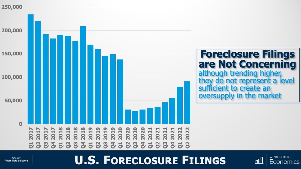
For the purposes of this exercise, I’m going to concentrate on foreclosure starts rather than foreclosure filings because data shows us that a majority of homeowners where a foreclosure filing has been submitted to a court by their lender are able to avoid it by refinancing or selling the home, which makes total sense as over 93% of owners in the U.S. have positive equity.


U.S. Foreclosures: Starts 2007-2022

A bar graph showing U.S. foreclosures starts from 2007 to 2022. The numbers spiked in 2009 at over 2 million foreclosure starts and gradually decreased every year until 2022, where the numbers increased from 2021. Though they were 181% higher in 2022 than in 2021, it’s important to note that foreclosure starts in 2022 were 31% lower than 2019 and 88% lower than the 2009 peak.


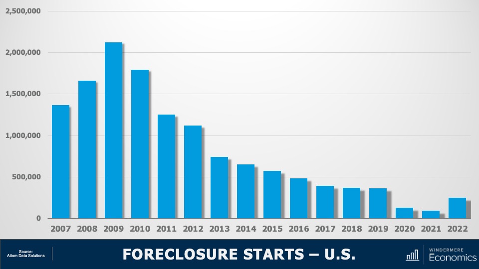
As you can see here, foreclosure starts rose significantly last year. In fact, they were 181% higher than in 2021. But if we zoom out, it’s important to note that foreclosure starts were 31% lower than 2019 and 88% lower than the 2009 peak.

Am I surprised at the increase in foreclosure starts? Not really. The forbearance program was put in place at the start of the pandemic, and it allowed homeowners to temporarily stop making mortgage payments and not be foreclosed on, but that program ended 18 months ago.

And, although a vast majority of the 4.7 million households who entered the program have left it and sold or refinanced their homes, there were always going to be some who were not able to, and this has led to the overall foreclosure activity rising. Let’s take a closer look.


U.S. Foreclosures in 2022

A map showing foreclosures starts for each state in the U.S. California, Texas, and Florida have the highest number of foreclosure starts inn 2022. California had 27,541, Florida had 24,190, and Texas had 23,151.


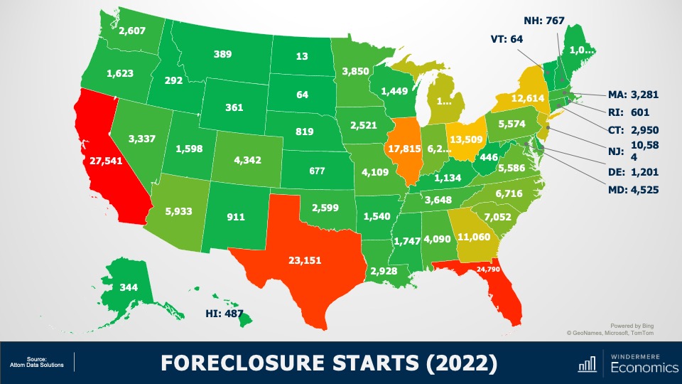
This is a heat map of foreclosure starts by state. And you can see that California, Florida, and Texas saw the highest numbers in 2022. But remember that these are the states that have the greatest number of homes with mortgages so, statistically, we would expect the total number of homes in foreclosure in those states would be higher than the rest of the country. That said, foreclosure starts were significantly higher in Florida, California, Texas, and New York than they were in 2019, the last “pre-COVID” year and before the forbearance program started.

And when we look more myopically, metro areas including New York/New Jersey, Washington DC, the Delaware Valley, Atlanta, Miami, Baltimore, and Dallas all saw total foreclosure starts rise well above what they were in 2019. This may suggest that there are some markets that could see foreclosure activity rise to a level that could materially impact housing in those locations.

But looking at the country as a whole, there are other factors leading me to believe that we will not see the number of homes entering foreclosure rising above the long-term average, and certainly not sufficient to have a material impact on U.S. housing prices. 

Let me show you what’s happening on the mortgage side of things. First: credit quality.


Median FICO Scores for New Mortgages 2003-2022

A line graph showing the median FICO scores for new mortgages from Q1 2003 through Q3 2022. The median FICO score generally decreased from 2003 to the low of 707 during 2007, then gradually increased throughout the years 2008-2022. The median FICO score inn Q3 2022 was 766.


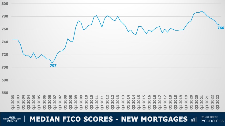
The median FICO score for new mortgages was 766 in the 4th quarter of 2022. Yes, this is down from the peak seen in early 2021 when it was a whopping 788 but as shown here, it’s far higher than we saw before the housing crisis. Buyers over the past several years had very good credit and, given the tight labor market, we are certainly in a very different place than back before the housing bubble burst.


Mortgage Debt Payments Percentages 2007-2022

A line graph showing mortgage debt payments as a percentage of disposable personal income for home buyers from Q1 2007 through Q3 2022. In 2007, mortgage debt payments were around 7% of disposable personal income, in Q3 2022 it was 3.99%. Between those two points in time, the percentage gradually and consistently decreased.


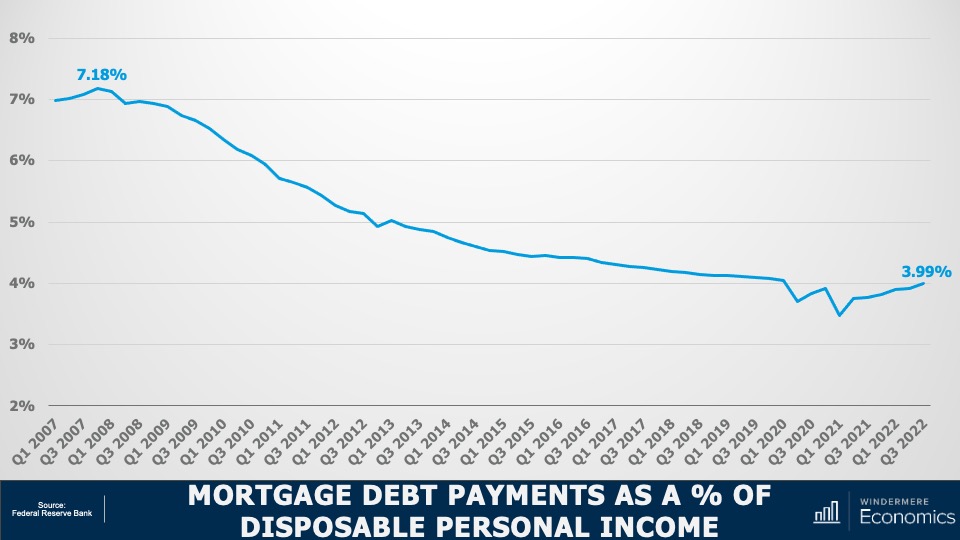
Secondly, buyers are using larger down payments than in the mid-2000’s, and with the historically low mortgage rates that we saw during the first two years of the pandemic benefitting new buyers as well as allowing existing homeowners to refinance, the share of disposable income that is used to cover mortgage payments remains very low. This basically means that owners aren’t as burdened by their house payments as they were in 2007-2009. And finally…


Equity Rich Households Q4 2022

A map showing the percentage of equity rich households for each state in Q4 2022. The highest values are Vermont at 76.6%, Florida at roughly 62%, and California at 61.5%.


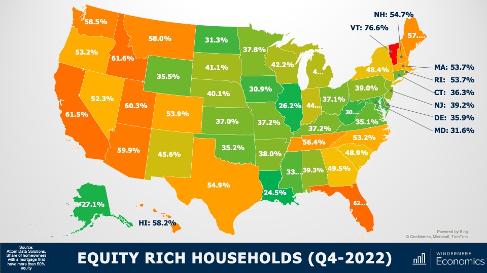
With the significant run-up in housing values that we have seen over the past few years, 48% of all homeowners with a mortgage have more than 50% equity. Although this share has pulled back a little as mortgage rates rose and values pulled back, it’s still a massive amount of money and, as I mentioned earlier, many homeowners who are faced with foreclosure will end up selling their homes as they still have positive equity rather than go through the foreclosure process.

So, my answer to those of you wondering if we will see foreclosures rise to a level that could impact the overall housing market is “no.”

I don’t see any reason to believe that distressed sales will hurt the market in general, but I will say that there are some local markets where distressed sales could rise to levels that could act as a headwind to price growth in these areas. As always, I’d love to get your thoughts on this topic so please comment below! Until next month, take care and I will see you all soon. Bye now.


To see the latest housing data for your area, visit our quarterly Market Updates page.


About Matthew Gardner

As Chief Economist for Windermere Real Estate, Matthew Gardner is responsible for analyzing and interpreting economic data and its impact on the real estate market on both a local and national level. Matthew has over 30 years of professional experience both in the U.S. and U.K.

In addition to his day-to-day responsibilities, Matthew sits on the Washington State Governors Council of Economic Advisors; chairs the Board of Trustees at the Washington Center for Real Estate Research at the University of Washington; and is an Advisory Board Member at the Runstad Center for Real Estate Studies at the University of Washington where he also lectures in real estate economics.

Article originally appears on windermere.com

Renting vs. Buying a Home on Whidbey Island: The Financial Benefits of Homeownership

This video is the latest in our Monday with Matthew series with Windermere Chief Economist Matthew Gardner. Each month, he analyzes the most up-to-date U.S. housing data to keep you well-informed about what’s going on in the real estate market.


Renting vs. Buying a Home

One of my followers asked me about some of the financial benefits of owning your home as opposed to renting. I find this topic interesting as there really is a “laundry list” of reasons that, from a financial standpoint, owning a home is better than renting.

I’m Matthew Gardner Chief Economist at Windermere Real Estate and welcome to this month’s episode of Monday with Matthew. Let’s get to the topic at hand. Of course, I don’t have time to go through them all today but here are the ones that I think are the most compelling: wealth building and tax benefits.

The Financial Benefits of Homeownership 

The first thing to understand is that, over time, a mortgage becomes easier to afford. You see, when you buy a home, the mortgage payments themselves don’t change and, over time, your earnings rise but the mortgage payment doesn’t. Simply put, unlike renters who generally see their rents going up every year, your mortgage payment never will and because you’ll hopefully be making more money as time goes by, the share of your income that you spend on a mortgage payment becomes less & less.

The next advantage to owning your home is that it is a good long-term investment. Of course, some will say that this is not the case because we went through the housing bubble bursting back in 2006 but there have actually been very few times in history when home prices have seen any long-term downward adjustment.

Now I know some will say that investing in stocks would give you a higher long-term return. My response to that would be I’ve never seen anyone living under a stock certificate. Have you?

My next reason for believing that ownership is better than renting is rather simple, and that is because a portion of every mortgage payment you make goes toward reducing the principal amount of the loan. Of course, during a majority of the term of the mortgage most of the payment is going towards interest but, a small portion is paying down the debt itself—in essence making it a forced savings plan, building wealth along the way.

Tax Advantages of Owning a Home

But what about the tax advantages? Owning a home offers unique and substantial ways to save on your taxes every year. Firstly, you can deduct your real estate taxes every year. Now, tax reform has limited the total allowed deduction, but it is still meaningful. You can also deduct the interest you pay on your mortgage. Again, there are some limitations but, depending on where you live you could save a significant amount.

And finally, let’s talk Capital Gains Taxes. When you sell your primary residence and have seen its value grow since you purchased it, up to $250,000 of that profit (if you’re a single person) or $500,000 if you’re married and filing jointly is tax free. Now, this is only true if you meet certain requirements with the biggest one being that you have to have lived in the house for a minimum of two years during the preceding five-year period.

If that’s not enough to convince you that there are very significant advantages to owning a home over renting, I will leave you with one last datapoint that you may find of interest.

Renting vs. Owning a Home: Household Net Worth

Using Federal Reserve data as a base, I’ve been able to calculate the median net worth of a household in America who owned their homes versus a household that rents.

  • In 2022, the median household wealth of a homeowner household here in America was approximately $330,000.
  • The median household wealth for a renter household in this country last year was just $8,000.

As you can see, that’s quite the discrepancy between the two. I think it’s very clear that homeownership for a vast majority of families is how they create most of their wealth.

I hope you found this topic of interest. Of course, if you have any questions or comments please do let me know as I do enjoy hearing from you. Take care and I look forward to talking to you all again next month.


Data combined and calculated by Windermere Economics


About Matthew Gardner

As Chief Economist for Windermere Real Estate, Matthew Gardner is responsible for analyzing and interpreting economic data and its impact on the real estate market on both a local and national level. Matthew has over 30 years of professional experience both in the U.S. and U.K.

In addition to his day-to-day responsibilities, Matthew sits on the Washington State Governors Council of Economic Advisors; chairs the Board of Trustees at the Washington Center for Real Estate Research at the University of Washington; and is an Advisory Board Member at the Runstad Center for Real Estate Studies at the University of Washington where he also lectures in real estate economics.

Article originally appears on windermere.com

Q4 2022 Western Washington Real Estate Market Update


The following analysis of select counties of the Western Washington real estate market is provided by Windermere Real Estate Chief Economist Matthew Gardner. We hope that this information may assist you with making better-informed real estate decisions. For further information about the housing market in your area, please don’t hesitate to contact your Windermere Real Estate agent.


Regional Economic Overview

Although the job market in Western Washington continues to grow, the pace has started to slow. The region added over 91,000 new jobs during the past year, but the 12-month growth rate is now below 100,000, a level we have not seen since the start of the post-COVID job recovery. That said, all but three counties have recovered completely from their pandemic job losses and total regional employment is up more than 52,000 jobs. The regional unemployment rate in November was 3.8%, which was marginally above the 3.7% level of a year ago. Many business owners across the country are pondering whether we are likely to enter a recession this year. As a result, it’s very possible that they will start to slow their expansion in anticipation of an economic contraction.

Western Washington Home Sales

❱ In the final quarter of 2022, 12,711 homes sold, representing a drop of 42% from the same period in 2021. Sales were 34.7% lower than in the third quarter of 2022.

❱ Listing activity rose in every market year over year but fell more than 26% compared to the third quarter, which is expected given the time of year.

❱ Home sales fell across the board relative to the fourth quarter of 2021 and the third quarter of 2022.

❱ Pending sales (demand) outpaced listings (supply) by a factor of 1:2. This was down from 1:6 in the third quarter. That ratio has been trending lower for the past year, which suggests that buyers are being more cautious and may be waiting for mortgage rates to drop.

A bar graph showing the annual change in home sales for various counties in Western Washington from Q4 2021 to Q4 2022. All counties have a negative percentage year-over-year change. Here are the totals: Jefferson at -19.9%, Skagit at -27.7%, Mason -30.7%, Lewis -30.9%, Clallam -34.3%, Whatcom -36.3%, Kitsap -38.5%, Snohomish -40.3%, Island -42%, Grays Harbor -42.3%, King -43.1%, Thurston -45.8%, San Juan -46.8%, Pierce -46.9%.

Western Washington Home Prices

❱ Sale prices fell an average of 2% compared to the same period the year prior and were 6.1% lower than in the third quarter of 2022. The average sale price was $702,653.

❱ The median listing price in the fourth quarter of 2022 was 5% lower than in the third quarter. Only Skagit County experienced higher asking prices. Clearly, sellers are starting to be more realistic about the shift in the market.

❱ Even though the region saw aggregate prices fall, prices rose in six counties year over year.

❱ Much will be said about the drop in prices, but I am not overly concerned. Like most of the country, the Western Washington market went through a period of artificially low borrowing costs, which caused home values to soar. But now prices are trending back to more normalized levels, which I believe is a good thing.

A map showing the real estate home prices percentage changes for various counties in Western Washington. Different colors correspond to different tiers of percentage change. Grays Harbor and Whatcom Counties have a percentage change in the -6.5% to -3.6%+ range, Clallam, Jefferson, King, and Skagit counties are in the -3.5% to -0.6% change range, Snohomish and Pierce are in the -0.5% to 2.4% change range, Mason, Thurston, Island, and Lewis counties are in the 2.5% to 5.4% change range, and San Juan County is in the 5.5%+ change range.

A bar graph showing the annual change in home sale prices for various counties in Western Washington from Q4 2021 to Q4 2022. San Juan County tops the list at 6.9%, followed by Lewis at 4.8%, Thurston at 3.8%, Island at 3.7%, Mason at 3.5%, Snohomish at 0.8%, Pierce at -0.2%, Clallam at -1%, Skagit at -2.1%, Jefferson at -2.5%, King at -3.1%, Whatcom at -4.1%, Kitsap at -5.3%, and finally Grays Harbor at -6.5%.

Mortgage Rates

Rates rose dramatically in 2022, but I believe that they have now peaked. Mortgage rates are primarily based on the prices and yields of bonds, and while bonds take cues from several places, they are always impacted by inflation and the economy at large. If inflation continues to fall, as I expect it will, rates will continue to drop.

My current forecast is that mortgage rates will trend lower as we move through the year. While this may be good news for home buyers, rates will still be higher than they have become accustomed to. Even as the cost of borrowing falls, home prices in expensive markets such as Western Washington will probably fall a bit more to compensate for rates that will likely hold above 6% until early summer.

A bar graph showing the mortgage rates from Q4 2020 to the present, as well as Matthew Gardner's forecasted mortgage rates through Q4 2023. After the 6.79% figure in Q4 2022, he forecasts mortgage rates dipping to 6.27% in Q1 2023, 6.09% in Q2 2023, 5.76% in Q3 2023, and 5.42% in Q4 2023.

Western Washington Days on Market

❱ It took an average of 41 days for homes to sell in the fourth quarter of 2022. This was 17 more days than in the same quarter of 2021, and 16 days more than in the third quarter of 2022.

❱ King County was again the tightest market in Western Washington, with homes taking an average of 31 days to find a buyer.

❱ All counties contained in this report saw the average time on market rise from the same period a year ago.

❱ Year over year, the greatest increase in market time was Snohomish County, where it took an average of 23 more days to find a buyer. Compared to the third quarter of 2022, San Juan County saw average market time rise the most (from 34 to 74 days).

A bar graph showing the average days on market for homes in various counties in Western Washington for Q4 2022. King County has the lowest DOM at 31, followed by Kitsap at 45, Island and Snohomish at 35, Whatcom, Thurston, and Skagit at 36, Pierce at 37, Clallam at 38, Jefferson at 40, Mason at 43, Grays Harbor at 46, Lewis at 49, and San Juan at 74.

Conclusions

This speedometer reflects the state of the region’s real estate market using housing inventory, price gains, home sales, interest rates, and larger economic factors.

The regional economy is still growing, but it is showing signs of slowing. Although this is not an immediate concern, if employees start to worry about job security, they may decide to wait before making the decision to buy or sell a home. As we move through the spring I believe the market will be fairly soft, but I would caution buyers who think conditions are completely shifting in their direction. Due to the large number of homeowners who have a mortgage at 3% or lower, I simply don’t believe the market will become oversupplied with inventory, which will keep home values from dropping too significantly.

A speedometer graph indicating a balanced market, barely leaning toward a seller's market in Western Washington in Q4 2022.

Ultimately, however, the market will benefit buyers more than sellers, at least for the time being. As such, I have moved the needle as close to the balance line as we have seen in a very long time.

About Matthew Gardner

Matthew Gardner - Chief Economist for Windermere Real Estate

As Chief Economist for Windermere Real Estate, Matthew Gardner is responsible for analyzing and interpreting economic data and its impact on the real estate market on both a local and national level. Matthew has over 30 years of professional experience both in the U.S. and U.K.

In addition to his day-to-day responsibilities, Matthew sits on the Washington State Governors Council of Economic Advisors; chairs the Board of Trustees at the Washington Center for Real Estate Research at the University of Washington; and is an Advisory Board Member at the Runstad Center for Real Estate Studies at the University of Washington where he also lectures in real estate economics.

Article originally appears on windermere.com

Real Estate Top 10 Predictions for 2023 - Matthew Gardner


This video shows Windermere Chief Economist Matthew Gardner’s Top 10 Predictions for 2023. Each month, he analyzes the most up-to-date U.S. housing data to keep you well-informed about what’s going on in the real estate market.


Real Estate Top 10 Predictions for 2023 - Matthew Gardner

1. There Is No Housing Bubble

Mortgage rates rose steeply in 2022 which, when coupled with the massive run-up in home prices, has some suggesting that we are recreating the housing bubble of 2007. But that could not be further from the truth.

Over the past couple of years, home prices got ahead of themselves due to a perfect storm of massive pandemic-induced demand and historically low mortgage rates. While I expect year-over-year price declines in 2023, I don’t believe there will be a systemic drop in home values. Furthermore, as financing costs start to pull back in 2023, I expect that will allow prices to resume their long-term average pace of growth.

2. Mortgage Rates Will Drop

Mortgage rates started to skyrocket at the start of 2022 as the Federal Reserve announced their intent to address inflation. While the Fed doesn’t control mortgage rates, they can influence them, which we saw with the 30-year rate rising from 3.2% in early 2022 to over 7% by October.

Their efforts so far have yet to significantly reduce inflation, but they have increased the likelihood of a recession in 2023. Therefore, early in the year I expect the Fed to start pulling back from their aggressive policy stance, and this will allow rates to begin slowly stabilizing. Rates will remain above 6% until the fall of 2023 when they should dip into the high 5% range. While this is higher than we have become used to, it’s still more than 2% lower than the historic average.

3. Don’t Expect Inventory to Grow Significantly

Although inventory levels rose in 2022, they are still well below their long-term average. In 2023 I don’t expect a significant increase in the number of homes for sale, as many homeowners do not want to lose their low mortgage rate. In fact, I estimate that 25-30 million homeowners have mortgage rates around 3% or lower. Of course, homes will be listed for sale for the usual reasons of career changes, death, and divorce, but the 2023 market will not have the normal turnover in housing that we have seen in recent years.

4. No Buyer’s Market But a More Balanced One

With supply levels expected to remain well below normal, it’s unlikely that we will see a buyer’s market in 2023. A buyer’s market is usually defined as having more than six months of available inventory, and the last time we reached that level was in 2012 when we were recovering from the housing bubble. To get to six months of inventory, we would have to reach two million listings, which hasn’t happened since 2015. In addition, monthly sales would have to drop below 325,000, a number we haven’t seen in over a decade. While a buyer’s market in 2023 is unlikely, I do expect a return to a far more balanced one.

5. Sellers Will Have to Become More Realistic

We all know that home sellers have had the upper hand for several years, but those days are behind us. That said, while the market has slowed, there are still buyers out there. The difference now is that higher mortgage rates and lower affordability are limiting how much buyers can pay for a home. Because of this, I expect listing prices to pull back further in the coming year, which will make accurate pricing more important than ever when selling a home.

6. Workers Return to Work (Sort of)

The pandemic’s impact on where many people could work was profound, as it allowed buyers to look further away from their workplaces and into more affordable markets. Many businesses are still determining their long-term work-from-home policies, but in the coming year I expect there will be more clarity for workers. This could be the catalyst for those who have been waiting to buy until they know how often they’re expected to work at the office.

7. New Construction Activity Is Unlikely to Increase

Permits for new home construction are down by over 17% year over year, as are new home starts. I predict that builders will pull back further in 2023, with new starts coming in at a level we haven’t seen since before the pandemic.

Builders will start seeing some easing in the supply chain issues that hit them hard over the past two years, but development costs will still be high. Trying to balance homebuilding costs with what a consumer can pay (given higher mortgage rates) will likely lead builders to slow activity. This will actually support the resale market, as fewer new homes will increase the demand for existing homes.

8. Not All Markets Are Created Equal

Markets where home price growth rose the fastest in recent years are expected to experience a disproportionate swing to the downside. For example, markets in areas that had an influx of remote workers, who flocked to cheaper housing during the pandemic, will likely see prices fall by a greater percentage than other parts of the country. That said, even those markets will start to see prices stabilize by the end of 2023 and resume a more reasonable pace of price growth.

9. Affordability Will Continue to Be a Major Issue

In most markets, home prices will not increase in 2023, but any price drop will not be enough to make housing more affordable. And with mortgage rates remaining higher than they’ve been in over a decade, affordability will continue to be a problem in the coming year, which is a concerning outlook for first-time buyers.

Over the past two years, many renters have had aspirations of buying but the timing wasn’t quite right for them. With both prices and mortgage rates spiraling upward in 2022, it’s likely that many renters are now in a situation where the dream of homeownership has gone. That’s not to say they will never be able to buy a home, just that they may have to wait a lot longer than they had hoped.

10. Government Needs to Take Housing More Seriously

Over the past two years, the market has risen to such an extent that it has priced out millions of potential home buyers. With a wave of demand coming from Millennials and Gen Z, the pace of housing production must increase significantly, but many markets simply don’t have enough land to build on. This is why I expect more cities, counties, and states to start adjusting their land use policies to free up more land for housing.

But it’s not just land supply that can help. Elected officials can assist housing developers by utilizing Tax Increment Financing tools, whereby the government reimburses a private developer as incremental taxes are generated from housing development. There are many tools like this at the government’s disposal to help boost housing supply, and I sincerely hope that they start to take this critical issue more seriously.


About Matthew Gardner

As Chief Economist for Windermere Real Estate, Matthew Gardner is responsible for analyzing and interpreting economic data and its impact on the real estate market on both a local and national level. Matthew has over 30 years of professional experience both in the U.S. and U.K.

In addition to his day-to-day responsibilities, Matthew sits on the Washington State Governors Council of Economic Advisors; chairs the Board of Trustees at the Washington Center for Real Estate Research at the University of Washington; and is an Advisory Board Member at the Runstad Center for Real Estate Studies at the University of Washington where he also lectures in real estate economics.

Are We in a Housing Recession?

This video is the latest in our Monday with Matthew series with Windermere Chief Economist Matthew Gardner. Each month, he analyzes the most up-to-date U.S. housing data to keep you well-informed about what’s going on in the real estate market.


Hello there, I’m Windermere’s Chief Economist Matthew Gardner and welcome to this month’s episode of Monday with Matthew. A little while ago, a housing analyst was being interviewed about the current state of the residential market and they suggested that the country is in a “housing recession.” Well, needless to say, this got a lot of attention from the media and the public at large—for obvious reasons.

Any time the word “recession” is mentioned we almost subliminally cast our minds back to 2007. And when the word “recession” is combined with the word “housing,” then panic starts to set in with flashbacks of headlines about burgeoning housing supply, plummeting home prices, and surging foreclosures.

As this is a topic being discussed by many across the country right now, I wanted to share with you my opinion as to whether the phrase “housing recession” is an appropriate one when describing today’s market.

So, what is a recession? To answer this, I will turn to my trusted Oxford English Dictionary, and this is how they describe that word.

Definition of a Recession

A slide showing two definitions of the word "recession" from the Oxford English Dictionary. The first definition is for both countable and uncountable contexts, which defines a recession as quote a difficult time for the economy of a country, when there is less trade and industrial activity than usual and more people are unemployed end quote. The second definition is the more formal of the two, applicable in uncountable contexts. The definition reads quote the movement backward of something from a previous position end quote.

Image Source: Matthew Gardner


Recession:

  • a difficult time for the economy of a country, when there is less trade and industrial activity than usual, and more people are unemployed
  • the movement backward of something from a previous position

Well, how do we use these definitions when it comes to the ownership housing market?

I guess that “less trade” could mean lower sales and we have certainly seen sales pull back. “Movement backward” could be how someone might describe the fact that sale prices have been pulling back in many markets across the country.

But although some may say that we really are in a housing recession given the definition of the word, is it really accurate? Are we are inextricably headed down a road that leads to the bursting of some sort of bubble as we all remember from 2007? I don’t believe we are. To explain my thinking let’s start out by looking at housing supply.

Inventory of Homes for Sale

A line graph titled "Inventory of Homes for Sale," showing the months January 2021 through July 2022 on the x-axis and numbers in millions on the y-axis ranging from 0.8 to 1.3. The graph shows that listing activity has risen from an all-time low of 900,000 during February 2022 to over 1.2 million units in July 2022—a 35.6% increase. Between January 2021 and October 2021, inventory ranged between 1.1 and 1.2 million before plummeting steadily toward the all-time low of 900,000 in February. Since then, inventory has rebounded to over 1.2 million again almost as quickly as it dropped.

Image Source: Matthew Gardner


Yes, listing activity is up—can’t argue with that—with the number of resale homes for sale jumping by more than a third from the start of this year. But there’s more to it than that. You see, we have to look a little further back to better understand what’s really going on.

And to do this, let’s check out the number of homes for sale during the first seven months of this year and compare those numbers to the same periods in 2018 through 2021.

Active Listings By Month

A multi-line graph titled "Active Listings by Month" showing the number of active listings for the years 2018, 2019, 2020, 2021, and 2022. The x-axis contains the months January through July, and the y-axis shows the number of listings ranging from 600,000 to two million. Overall, the graph indicates that listings remain well below the long-term average, and that the number of homes for sale in July 2022 exactly matches that of July 2021. 2022's January value is the lowest of the selected years, followed in order by 2021, 2020, 2018, and 2019. 2019 began the year with around 1.6 million active listings. In short, the July numbers show that there were hundreds of thousands more active listings in 2018 and 2019 than 2020 through 2022.

Image Source: Matthew Gardner


I don’t know about you, but this doesn’t look like a chart showing a massively oversupplied market! The number of homes for sale in July of this year was almost exactly the same as we saw last July and is still well below the levels seen in 2018, 2019, or 2020.

Sure, listings are up. But are we at levels that will cause prices to tumble? Remember that it was a massive increase in the number of homes for sale that led to the housing bubble bursting back in 2007. Listings peaked at almost 3.9 million units in 2006; but today there are 2.6 million fewer units on the market than we saw back then. Now that we’ve seen that supply isn’t at concerning levels, let’s look at demand.

Existing Home Sales

A line graph titled "Existing Home Sales." The x-axis shows every other month from January 2020 to July 2022, and the y-axis shows numbers in millions ranging from 0 to 7.0. Overall, the graph shows that, although they remain higher than the levels we saw at the beginning of the COVID-19 pandemic, home sales have been falling since January 2022. Home sales dipped sharply in March 2020 due to the onset of the pandemic, going from above 5 million to 4 million. By September 2020, existing home sales rose above 6 million, and hovered around that mark until January 2022. In July 2022, existing home sales dipped below 5 million again.

Image Source: Matthew Gardner


This chart doesn’t look too good. On an annualized basis, sales have been pulling back since the start of the year but that’s not the full story. Let’s look at this in a slightly different way.

Year-to-Date Sales

A multi-bar chart titled "Year-to-Date Sales" showing non-seasonally adjusted and seasonally adjusted sales for the past five years. The years 2018 through 2022 are represented on the x-axis, while the y-axis shows numbers in millions ranging from 0 to 4.0. 2022 year-to-date sales are lower than they were last year, but unadjusted for seasonality, year-to-date sales are higher than 2019 or 2020. And when adjusted for seasonal shifts, 2022's year-to-date sales are higher than 2018, 2019, and 2020. 2021 has the highest year-to-date sales totals, with both non- and seasonally adjusted sales figures right around 3.5 million.

Image Source: Matthew Gardner


The bars here show year-to-date sales through July—both adjusted and unadjusted for seasonality—and although unadjusted sales so far this year are lower than we saw during the first seven months of 2021, they are at about the same level as we saw in 2018 and are higher than in 2019 or 2020.

But when we adjust the monthly sales data for seasonality, year-to-date sales in 2022 were higher than all years shown here other than 2021.

So, although sales have fallen, it appears to me that we are heading back to a more realistic market rather than one that is hemorrhaging. Yet another indicator we need to consider when examining the market for evidence of some sort of recession are months of inventory , which shows how long it would take to sell every home for sale using the current monthly sales pace.

Months of Inventory

A line graph titled "Months of Inventory," which reflects how long it would take every home on the market to sell given the current housing market conditions. The x-axis displays the months January 2021 through July 2022, and the y-axis shows the number of months ranging from 0 to 3.5. The chart shows a figure of 3.3 months of inventory for July, indicating a seller's market. A balanced market is 4 to 6 months of inventory. From January 2021 to August 2021, months of inventory rose from below 2.0 to above 2.5, then dipped to just above 1.5 in January 2022. Since then, months of inventory has steadily risen to the 3.3-month figure in July 2022.

Image Source: Matthew Gardner


This graph shows that it would take three months to sell every home on the market given the sales we saw in July. That is quite a jump from the January pace but, again, perspective is everything.

Months of Inventory: Seller’s Market

A line graph titled "Months of Inventory," which presents an expanded view of inventory dating back to the year 2000. The x-axis shows the years 2000 through 2022, and the y-axis shows the months of inventory ranging from 0 to 13. The graph shows that as of 2022, we are still in a seller's market, even though listings have risen and sales have slowed. A balanced market—marked by 4-6 months inventory—is still not present. From 2000 to early 2006, the housing market stayed below 6, then leapt up to roughly 10 months by 2008. The highest months of inventory displayed is 13 between 2010 and 2011. Since then, the overall direction of the chart has trended downwards, with the lowest figure—below 2 months of inventory—appearing in late 2021/early 2022.

Image Source: Matthew Gardner


At three months, it is still a seller’s market. It’s generally accepted that the definition of a seller’s market is any number below four months; a balanced market is four to six months of inventory, and a buyer’s market is when the month of inventory is above six.

And a simple bit of math shows us that, for the market to shift from favoring sellers to favoring buyers, the number of homes for sale must break above two million—which we haven’t seen since 2015—and monthly sales would have to drop to below 300,000. We’ve only seen that happen three times in history: November 2008, and again in July and August of 2010.

Yes, listings are up, and sales are down. There’s no denying it. But, again, does the data justify the term recession? My answer would be no. But, if you’re still not convinced, let’s turn our attention to sale prices. I think that might help make things even clearer.

Median U.S. Existing Home Price

A line graph titled "Median U.S. Existing Home Price." It shows home sale price figures (displayed on the y-axis from $100,000 to $450,000) for the months January and July from 2012 through 2022 (displayed on the x-axis). a solid line tracks the median home price, showing a gradual increase over time from roughly $150,000 in January 2012 to over $400,000 in July 2022. A dotted line runs through the middle of the undulations in the solid line, following the same upward trend from 2012 through the end of 2020. But during early 2021, the solid line breaks away from the trend line, which reflects the historically low levels of mortgage rates at that time. Sale prices are starting to pull back, given the affordability constraints and high financing costs in the housing market status quo. Windermere Chief Economist Matthew Gardner expects this pull-back of prices to continue.

Image Source: Matthew Gardner


The solid line represents the median sale prices of homes over time and the dotted line shows the trend. You can clearly see that we started breaking away from the trend line in early 2021 and that’s not at all surprising as it started the month after mortgage rates hit their historic all-time low.

But today’s financing costs are significantly higher, and prices have started to slide. Although I certainly expect that we will see sale prices fall further, it appears to me as if they are simply moving back to the long-term trend, and not collapsing.

Mortgage Rate Forecasts

A multi-bar chart titled "Mortgage Rate Forecasts" showing how several institutions foresee mortgage rates in 2023. The chart shows Fannie Mae's 2023 prediction of 4.5%, followed by Freddie Mac's 5.1%, Mortgage Bankers Association's (MBA) 4.9%, 6.0% for the National Association of REALTORS® (NAR), 5.3% for Wells Fargo, and Matthew's forecast of 5.3%. Overall, rates remain higher than buyers are used to, but will not get close to the long-term average of 7.5%. It is generally accepted that mortgage rates are likely to start pulling back modestly in 2023.

Image Source: Matthew Gardner


With mortgage rates doubling from their 2021 lows, downward pressure on sale price was to be expected. But will they—as some think—rise to a level that will cause home prices to plummet? To answer that, here are the forecasts of several associations. You’ll see that all, bar the National Association of Realtors and Freddie Mac, see rates pulling back—albeit modestly—in 2023.

Of course, all these are annual averages and today’s rates are higher with the latest Freddie Mac data showing the average 30-year fixed rate above 6%—a level we haven’t seen since 2008.

However, economists including myself find it unlikely that rates will continue rising significantly from where they are today. The mortgage market is certainly in a bit of disarray right now with the yield curve inverting, but that should correct itself by early next year and that’s why we generally expect rates to start pulling back from their current levels by the start of 2023.

But if rising rates are triggering memories of 2008, you wouldn’t be alone. There are some expecting that the spike in rates will trigger a surge in foreclosures and that will doom the market. But as you see here, although foreclosure filings have certainly risen, they are still remarkably low compared to historic standards.

U.S. Foreclosure Filings

A bar graph titled "U.S. Foreclosure Filings" showing the number of home foreclosures (displayed on the y-axis from 0 to 250,000) in the U.S. from Q1 2017 to Q2 2022 (displayed on the y-axis). From Q1 2017 to Q2 2019, U.S. foreclosures remained above 150,000. Between Q1 and Q2 2020, foreclosures dropped from just below 150,000 to well below 50,000. This figure dropped further in Q3 2020 but has increased every quarter since. Windermere Chief Economist Matthew Gardner opines that this increasing trend of foreclosures is not concerning, since it does not yet represent a level of foreclosures sufficient to create an oversupply in the market.

Image Source: Matthew Gardner


In the second quarter, newly delinquent mortgages represented just 1.9% of all mortgages outstanding1 and that’s the lowest share the market has seen since 2006. Although I do expect the number of homes being foreclosed on will rise as we move into 2023, I just don’t see it getting to the levels necessary to materially impact the market. And a big part of the reasoning behind my thinking is this:

Equity Rich Households (Q2 2022)

A slide titled "Equity Rich Households (Q2 2022)" showing a map of the United States where each state's equity rich household percentage is displayed. "Equity rich" in this context signifies people with a mortgage that are sitting on more than 50% equity. The highest equity-rich state in the country is Vermont at 71.4%, followed by Idaho at 69.5%, and Arizona at 64.8%. The least equity rich state in the country is Louisiana at 23.4%, followed by Illinois at 25.4%, and Alaska at 26.7%.

Image Source: Matthew Gardner


In the second quarter of 2022, over 48% of homeowners with a mortgage were sitting on more than 50% equity.

Simply put, for enough homeowners to be put in a negative equity situation that would lead them to enter foreclosure and materially damage the market, home prices across the country would have to fall by a percentage greater than we saw during the market crash. And I just don’t see this happening.

The word “recession” has many connotations, and when it’s used to describe the housing market, it can engender a significant level of panic. So, I will ask you all. Given the data I have showed you today, do you think that we are in a housing recession?

Yes, supply levels have risen. But they are still relatively low when compared to historic averages and with builders slowing construction activity to a crawl, it’s unlikely that housing supply will grow much organically. Over the longer term, I believe that the supply of resale homes for sale will remain below historic averages. I say this for one simple reason: mortgage rates.

In 2020, a record number of households refinanced their homes to take advantage of the mortgage rates that had been plummeting. And in 2021, over six million home buyers got mortgages with rates averaging below 3%.

I would suggest to you that we will not see the number of homes for sale even get back to normalized levels in the mid-term, as many potential sellers will decide not to sell, because if they did, they would lose the never seen before and likely never to be seen again mortgage rate that they currently have.

Of course, there will be sellers who have to move because of factors such as job relocation, death, or divorce, but I would contend that listing activity may well be tight for a long time. And if supply remains below the level of demand, the market is further protected.

And as far as demand goes, let’s not forget that the age makeup of the country suggests that we will see a lot more potential buyers as Millennials and Generation Z mature, with current numbers suggesting significant buyer demand for the next two decades.

As for sale prices, I still believe (as do almost all economists) that the median home price next year will be higher than we will see this year, but a very significant drop in the pace of sales growth is likely as we trend down to historic averages.

Of course, all real estate is local and there are markets across the country that will see prices drop in absolute terms. But even in the most highly susceptible markets, it will be a temporary phenomenon. By 2024, homeowners in these markets will see the value of their homes start to rise again.

I’m going to leave you with my quote to describe today’s market today and it’s that we are in a “housing reversion,” NOT a housing recession.

As always, I’d love to hear your comments on my thoughts so feel free to reach out. In the meantime, stay safe out there and I’ll see you all again next month.


1: New York Fed Quarterly Report on Household Debt and Credit


About Matthew Gardner

As Chief Economist for Windermere Real Estate, Matthew Gardner is responsible for analyzing and interpreting economic data and its impact on the real estate market on both a local and national level. Matthew has over 30 years of professional experience both in the U.S. and U.K.

In addition to his day-to-day responsibilities, Matthew sits on the Washington State Governors Council of Economic Advisors; chairs the Board of Trustees at the Washington Center for Real Estate Research at the University of Washington; and is an Advisory Board Member at the Runstad Center for Real Estate Studies at the University of Washington where he also lectures in real estate economics.

The Continued Decline of the Housing Market Index

This video is the latest in our Monday with Matthew series with Windermere Chief Economist Matthew Gardner. Each month, he analyzes the most up-to-date U.S. housing data to keep you well-informed about what’s going on in the real estate market.


Hello there, I’m Windermere’s Chief Economist Matthew Gardner and welcome to this month’s episode of Monday with Matthew. Today we are going to take a look at the new home market where headwinds are certainly growing. And the reason this particular subject piqued my interest was that the National Association of Home Builders just released their Housing Market Index for August, and the numbers were certainly eye-opening.

Now, for those of you who may not be particularly familiar with this index, it is based on a survey of home builders which asks them to give their opinions on the single-family home market and asks them to rate current market conditions for the sale of homes today as well as in six months’ time. It also asks their opinion regarding foot traffic of prospective buyers to their new home communities.

NAHB Housing Market Index

A line graph titled "NAHB Housing Market Index." It shows the falling confidence of U.S. home builder in the Housing Market Index, which measures their perspective of current market conditions for the sale of new homes. The x-axis spans from January 2020 to August 2022. August's figure of 49 represents the eight consecutive drop in the index, and is the first time we've seen a number below 50 since May of 2020.


And as you can see, the headline index level fell six points to 49. The drop in August marked the eighth consecutive monthly decline for the Housing Market Index. It was also notable because it was the first time since May of 2020 that the index has dropped below the key 50 breakeven level. This is significant, as it tells us that today more home builders currently rate sales conditions as poor than good.

Now, while the August number was certainly lower than some economists had forecast, I was actually not too surprised as builders have been reporting a spike in cancelled contracts recently. In fact, a report I just read that was put out by John Burns Consulting suggested that the cancellations have more than doubled since April with 17.6% of buyers pulling out of their purchases in July. That compares to 8% in April and 7 ½% a year ago.

Housing Market Index Components

A multi-line graph titled "HMI Components." This chart shows the components behind home builder's falling confidence in the current market, displayed in the Housing Market Index. The three components displayed here are present single-family home sales, expectations (future sales), and traffic. All three are at their lowest levels since May 2020. Of the chart, Matthew Gardner says, "the present sales index fell seven points to 57 but is still above the breakeven point. The future sales series fell two points to 47, while prospective buyer traffic fell five points to 32 which, if we exclude the pandemic, represents the lowest index level since April of 2014."


This chart shows a breakdown of three components of the Housing Market Index which are all at their lowest levels since May of 2020, which was just before housing activity rebounded following the lockdown due to COVID-19.

  • The present sales index fell seven points to 57 but is still above the breakeven point
  • The future sales series fell two points to 47
  • Prospective buyer traffic fell five points to 32 which, if we exclude the pandemic, represents the lowest index level since April of 2014

I find this index has a very strong correlation with new home sales, but I also use it as a pretty reliable leading indicator when it comes to single-family housing starts. I’ll get to that shortly. The survey also stated that one in five builders had reduced prices in August. That might help to explain the 10-point spread between builders’ perception of current versus future sales. But there are limits on home builders’ ability to keep cutting prices in order to support sales. This has become a significant issue because many of them are currently holding a large stock of inventory.

New Homes for Sale

A bar graph titled "New Homes for Sale." It shows inventory levels for the period January 2020 through June 2022. Listings have risen 32.1% year over year, and are up 16% since the start of the year. Of the homes currently for sale, 67% are under construction, 24% have yet to break ground, and 95 are ready to occupy. The y-axis displays the number of new homes for sale in the thousands. June 2022 has the highest value on the chart, with an inventory level just above 450,000.


Here is what current inventory levels look like. Although you might think that it’s not that bad given that only 9% of available homes are finished are ready to move into, I would tell you that builders incur costs every day that a home is not sold, even if that home has yet to be built. And with inventory at a level not seen since 2008, I’m sure there are a lot of builders not sleeping too well right now.

I would add that by the time the above video is released, the July new home sales report will have been published. I can almost guarantee that the number of homes for sale will have grown further.

New Home Sales

A bar graph titled "New Home Sales." When taken in context of the "New Homes for Sale" chart mentioned earlier in this month's episode, Matthew Gardner is showing a decline in the pace of sales activity. Sales fell by over 8% month over month in June 2022, and are 17.4% lower than a year ago. On an adjusted basis, monthly sales were the lowest seen since before the pandemic.


Higher inventory levels are due to slower sales activity, which is continuing to decline. Sales are 17% lower than a year ago. With more homes for sale and lower transactions, it would now take more than nine months to absorb all available homes using the current sales pace. I would also tell you that the last time months of supply broke above nine was all the way back in 2010.

  • It’s my forecast that sales in July will have dropped from the annualized rate of 590,000 shown in the chart above to somewhere between 570,000 and 580,000.

U.S. Single-Family Housing Starts

A chart titled "U.S. Single Family Housing Starts." It shows the number of new home starts from January 2019 to July 2022. The most recent figures show starts have fallen 18.5% year over year. As Matthew Gardner explains, "With fewer buyers and rising inventory levels, builders have pulled back significantly. The number of building permits issues is 11.7% lower than a year ago."


With high supply levels and lower sales, it’s not at all surprising to see builders hitting the brakes, with new home starts falling by 10.1% between June and July of this year. Starts are down by 18 ½% from a year ago. Starts have dropped on a sequential basis for five consecutive months now, and I am afraid that they will drop further before finding a bottom.

So, what’s the bottom line here? Well, there are several issues I see, the first of which is affordability. Home prices have been spiraling upward since the start of the pandemic not only because mortgage rates dropped, but construction costs started jumping and builders had to charge more for a home.

Builders saw prices rise by almost 18% last year. This had already taken a significant toll on affordability even before the mortgage rates spike we saw earlier this year. The upshot, as I see it, is that tighter monetary policy from the Fed, in concert with construction costs that remain well above normal levels, has hit builders and hit them hard. Of course, they are doing their best to address the situation by slowing construction activity significantly, but I think that they are going to have a pretty rough time for the next several months.

Ultimately, I see little option for home builders other than lowering prices further, especially now that they are competing with rising inventories in the resale market. I also believe that there are buyers out there waiting patiently on the sidelines for prices to drop in the coming months as they know that builders at some point have to solve the current supply demand imbalance and lowering prices is the easiest way of doing this. Last month the average price drop was 5%, but this is very likely to increase as we move toward the fall.

Will builders get through the situation they find themselves in? I believe that they will. And there are some glimmers of light out there with inflation appearing to be peaking, interest rates are, if not dropping, then certainly stabilizing, and this will help.

Builders also understand that the country has a significant housing shortage. In fact, a recent report published by “Up For Growth” suggested that we have a housing shortage today of around 3.8 million homes. Although this includes rental and ownership housing, some basic math tells me that there is a need today for around 2.5 million new owner-occupied homes. So, light is definitely at the end of the tunnel, but there is a way to go before they get out of it.

And there you have it. I hope that you’ve found my thoughts on this topic of interest. As always, if you have any questions or comments about the current new home environment, please do reach out to me. In the meantime, stay safe out there and I look forward to visiting with you all again next month.

Bye now.


About Matthew Gardner

As Chief Economist for Windermere Real Estate, Matthew Gardner is responsible for analyzing and interpreting economic data and its impact on the real estate market on both a local and national level. Matthew has over 30 years of professional experience both in the U.S. and U.K.

In addition to his day-to-day responsibilities, Matthew sits on the Washington State Governors Council of Economic Advisors; chairs the Board of Trustees at the Washington Center for Real Estate Research at the University of Washington; and is an Advisory Board Member at the Runstad Center for Real Estate Studies at the University of Washington where he also lectures in real estate economics.

2022 Western Washington Real Estate Market Update | Q2


The following analysis of select counties of the Western Washington real estate market is provided by Windermere Real Estate Chief Economist Matthew Gardner. We hope that this information may assist you with making better-informed real estate decisions. For further information about the housing market in your area, please don’t hesitate to contact your Windermere Real Estate agent.

Click here to get the Printable PDF version of the report!

Regional Economic Overview

The most recent employment data (from May) showed that all but 2,800 of the jobs lost during the pandemic have been recovered. More than eight of the counties contained in this report show employment levels higher than they were before COVID-19 hit. The regional unemployment rate fell to 4.5% from 5.2% in March, with total unemployment back to pre-pandemic levels. For the time being, the local economy appears to be in pretty good shape. Though some are suggesting we are about to enter a recession, I am not seeing it in the numbers given rising employment and solid income growth.

Western Washington Home Sales

❱ In the second quarter of 2022, 23,005 homes sold, representing a drop of 11% from the same period a year ago, but up by a significant 52% from the first quarter of this year.

❱ Sales rose in Grays Harbor County compared to a year ago but fell across the balance of the region. The spring market, however, was very robust, likely due to growing inventory levels and buyers trying to get ahead of rising mortgage rates.

❱ Second quarter growth in listing activity was palpable: 175% more homes were listed than during the first quarter and 61.98% more than a year ago.

❱ Pending sales outpaced listings by a factor of 3:1. This is down from the prior year but only because of the additional supply that came to market.

A bar graph showing the annual change in home sales for various counties in Western Washington from Q2 2021 to Q2 2022. The only county with a positive percentage year-over-year change is Gray Harbor County at 4.9%. All other counties show a negative year-over-year change Here are the totals: Skagit -0.6%, Lewis -1.1%, Kitsap -1.3%, Cowlitz -5.4%, Clallam -5.8%, Jefferson -6.6%, Whatcom -6.7%, Thurston -7.3%, Snohomish -8.4%, Pierce -10.2%, Island -11.3%, Mason -11.7%, King -15.8%, and San Juan -38.2%.

Western Washington Home Prices

❱ Even in the face of rising mortgage rates, home prices continue to rise at a well-above-average pace, with average prices up 13.3% year over year to $830,941.

❱ I have been watching list prices as they are a leading indicator of the health of the housing market. Thus far, despite rising mortgage rates and inventory levels, sellers remain confident. This is reflected in rising median list prices in all but three counties compared to the previous quarter. They were lower in San Juan, Island, and Jefferson counties.

❱ Prices rose by double digits in all but four counties. Snohomish, Grays Harbor, Mason, and Thurston counties saw significant growth.

❱ List prices and supply are both trending higher, but this has yet to slow price growth significantly. I believe we will see the pace of appreciation start to slow, but not yet.

A map showing the real estate home prices percentage changes for various counties in Western Washington. Different colors correspond to different tiers of percentage change. San Juan County is the only county with a percentage change in the 5% to 7.9% range, Skagit, Lewis, and Cowlitz counties are in the 8% to 10.9% change range, Clallam, Jefferson, Kitsap, and Pierce are in the 11% to 13.9 % change range, King and Whatcom counties are in the 14% to 16.9% change range, and Grays Harbor, Mason, Thurston, and Snohomish counties are in the 17% + range.

A bar graph showing the annual change in home sale prices for various counties in Western Washington from Q2 2021 to Q2 2022. Snohomish county tops the list at 20.6%, followed by Grays Harbor at 18.9%, Mason at 18.4%, Thurston at 17.4%, Whatcom at 16.3%, King at 14.3%, Kitsap at 13.8%, Jefferson at 13.6%, Pierce at 13%, Clallam at 12.7%, Skagit at 10.8%, Lewis at 9.1%, Cowlitz at 8.9%, Island at 8.6%, and finally San Juan at 5.6%.

Mortgage Rates

Although mortgage rates did drop in June, the quarterly trend was still moving higher. Inflation—the bane of bonds and, therefore, mortgage rates—has yet to slow, which is putting upward pressure on financing costs.

That said, there are some signs that inflation is starting to soften and if this starts to show in upcoming Consumer Price Index numbers then rates will likely find a ceiling. I am hopeful this will be the case at some point in the third quarter, which is reflected in my forecast.

A bar graph showing the mortgage rates from 2020 to the present, as well as Matthew Gardner's forecasted mortgage rates through Q2 2023. He forecasts mortgage rates continuing to climb to 5.9% in Q4 2022, then tapering off to 5.58% in Q1 2023 and 5.53% in Q2 2023.

Western Washington Days on Market

❱ It took an average of 16 days for a home to go pending in the second quarter of the year. This was 2 fewer days than in the same quarter of 2021, and 9 fewer days than in the first quarter.

❱ Snohomish, King, and Pierce counties were, again, the tightest markets in Western Washington, with homes taking an average of between 8 and 10 days to sell. Compared to a year ago, average market time dropped the most in San Juan County, where it took 26 fewer days for a seller to find a buyer.

❱ All but six counties saw average time on market drop from the same period a year ago. The markets where it took longer to sell a home saw the length of time increase only marginally.

❱ Compared to the first quarter of this year, average market time fell across the board. Demand remains very strong.

A bar graph showing the average days on market for homes in various counties in Western Washington for Q2 2022. Snohomish and King counties have the lowest DOM at 8, followed by Thurston and Kitsap at 9, Pierce at 10, Island and Skagit at 12, Whatcom at 14, Mason at 16, Cowlitz at 17, Lewis at 20, Jefferson at 21, Clallam at 24, Grays Harbor at 25, and San Juan at 35.

Conclusions

This speedometer reflects the state of the region’s real estate market using housing inventory, price gains, home sales, interest rates, and larger economic factors.

The economy remains buoyant, which is an important factor when it comes to the regional housing market, particularly as it affects buyers. Even though the number of homes that came to market has jumped significantly, which should favor those looking for a new home, demand is still robust, and the market remains competitive.

A speedometer graph indicating a strong seller's market in Western Washington for Q2 2022.

Much to the disappointment of buyers, rising listing prices suggest that sellers are clearly still confident even as financing costs continue to increase. While the pace of price growth is slowing, sellers are still generally in control. As such, I have moved the needle a little more in the direction of sellers. Until we see list-price growth and home sales slow significantly, we will not reach a balanced market.

About Matthew Gardner

Matthew Gardner - Chief Economist for Windermere Real Estate

As Chief Economist for Windermere Real Estate, Matthew Gardner is responsible for analyzing and interpreting economic data and its impact on the real estate market on both a local and national level. Matthew has over 30 years of professional experience both in the U.S. and U.K.

In addition to his day-to-day responsibilities, Matthew sits on the Washington State Governors Council of Economic Advisors; chairs the Board of Trustees at the Washington Center for Real Estate Research at the University of Washington; and is an Advisory Board Member at the Runstad Center for Real Estate Studies at the University of Washington where he also lectures in real estate economics.

The Landscape for Mortgage Rates and Inflation in 2022


This video is the latest in our Monday with Matthew series with Windermere Chief Economist Matthew Gardner. Each month, he analyzes the most up-to-date U.S. housing data to keep you well-informed about what’s going on in the real estate market. 


Hello there, I’m Windermere’s Chief Economist Matthew Gardner and welcome to this month’s episode of Monday with Matthew. You know, one of the many things I love about being an economist is that it is a remarkably humbling profession. You see, just when we start to believe that our models are close to perfection, something comes along to remind us that forecasting isn’t an exact science.

And if you’re wondering what I am talking about, I recently took a look at the 2022 mortgage rate forecast I put out at the start of the year and…well, let’s say that rates rose at a far faster pace than I had anticipated. I thought that now would be a good time to take another look at rates and share my thoughts on the direction that they will likely take during the rest of the year and my reasoning behind it. And that means we need to talk about inflation.

30-Year Conventional Mortgage Rates: 2018 – 2022

A graph showing the 30-year conventional mortgage rates for the years 2018-2022. The curve of the graph creates a sine wave, increasing from roughly 4% to 5% in 2018, dropping to roughly 3.5% by the end of 2019, decreasing further to roughly 2.5% by the end of 2020, coming back up to roughly 3.0% by the end of 2021, and spiking up to over 5.8% in 2022 before dipping slightly.


So, a quick look back. As you can see, there wasn’t much to celebrate in 2018, with rates rising from 3.95% to 4.94% before pulling back and ending the year at around 4.5%. In 2019, rates fell following the Feds’ announcement that they were likely done with raising the Fed Funds Rate, and the mortgage market also reacted positively to the announcement from the White House that they were going to impose tariffs on select Chinese imported goods. We saw an uptick in late summer, but that was mainly due to news related to BREXIT.

In 2020, rates were dropping but spiked very briefly when COVID-19 shut the country down and bond markets panicked. But with the Fed jumping in with an emergency rate cut and announcing that they would start buying a significant number of treasuries and mortgage-backed securities, rates tumbled to an all-time low of just 2.66%. In 2021, rates rose as new COVID infections plummeted, but then dropped again as the Delta variant took hold, but ultimately trended modestly higher in the second half of the year.

And then we get to 2022. Rates started the year at just over 3.1% but have since skyrocketed to over 5.8% before a small pullback that started a few weeks ago. In as much as economists expected rates to rise this year, nobody anticipated how fast they would rise. So, what went wrong? Well, there’s actually a rather simple answer.

Even though we expected rates to trend higher in 2022, there were two things we hadn’t built into our forecast models.

  1. Russia’s invasion of the Ukraine
  2. Inflation continued to climb for far longer than we expected

So, how do things look for the rest of the year? To explain my thinking, it’s important to remember that the bond market and, by implication, mortgage rates hate nothing more than high inflation because when inflation is running hot, it limits demand for bonds which, in turn, forces the interest rate payable on bonds to rise and this pushes mortgage rates higher.

But what’s been fascinating to watch is that over the past couple of weeks, rates have actually been dropping which is certainly counterintuitive given where inflation is today. And the only reason I can see for this is that bond traders were thinking that inflation might be topping out.

But then we got the June CPI numbers, and it certainly didn’t suggest that inflation was slowing, in fact it showed the opposite. But even though the total inflation rate hasn’t yet peaked, I believe that a shift has actually started and that we are closer to a peak in inflation than you may think.

Indicators of Inflation: Consumer Spending

Three line graphs titled "Consumer Price Index," "Inflation Adjusted Consumer Spending," and PCE Price Index. The Consumer Price Index shows year-over-year percentage changes from present day back to January 2021, with two lines showing all items and all items less food and energy. The all items line starts around 1.5% in January 2021, gradually increasing to 9.1% in June 2022, while the all items less food and energy line also starts around 1.5% in January 2021 and undulates to 5.9% in June 2022. The "Inflation Adjusted Consumer Spending" chart shows month-over-month percentage changes from January 2021 to May 2022. The line spikes up and down throughout the first half of 2021, going as high as roughly 4.5% around March 2021 and as low as roughly negative 1.5% in February 2021. The line stabilizes for the remainder of the x-axis, ending at 0.4% in May 2022. The "PCE Price Index" graph shows year-over-year percentage changes from January 2021 to May 2022. The line starts around 1.5% in January 2021, gradually increasing through February 2022 around 5% before tapering to 4.7% in May 2022.


The June CPI report showed the headline inflation rate still trending higher but look at the core rate which excludes the volatile food & energy sectors. That has actually been pulling back for the past three months. And consumer spending when adjusted for inflation fell 0.4% in May. That’s the first monthly drop since last December, and I expect the June number when it comes out at the end of the month to show spending dropping even further.

This is a very important dataset that often gets overlooked but it is starting to tell me that the economy is slowing because of inflation and slower spending acts as a headwind to further price increases.

The core PCE price index is up 4.7% year-over-year, but this was the smallest annual increase since last November and you can see that it is also starting to roll over. This index is actually the Fed’s favored measure of inflation as it’s more comprehensive that the CPI number as it measures the change in spending for all consumers, not just urban households.

Indicators of Inflation: 5-Year Breakevens and Producer Price Index

Two line graphs titled "5-Year Inflation Breakevens" and "Producer Price Index." The breakevens graph shows percentage changes from January 2022 to July 2022, starting at 3.0% in January 2022, increasing to 3.59% in March 2022, before gradually decreasing to 2.50% in July 2022. The "Producer Price Index" graph shows year-over-year percentage changes from January 2020 to May 2022, with two lines showing Total PPI and Core PPI. Both lines gradually increase along the x-axis, peaking around March 2022. Total PPI increases from 2.0% from 10.8 in May 2022, while core PPI increases from 1.6% to 8.3% over the same time period.


The five-year “inflation breakeven” has plunged more than a full percentage point since peaking at just under 3.6% in late March. And this number is important as it lets us know where bond traders expect the average inflation rate to be over the next five years.

The Producer Price Index measures inflation at the wholesale, not retail, level and even though the total rate rose as energy costs continue to impact the manufacturing sector, the core rate has been pulling back for the past three months. Now let’s look at some commodity prices and see what’s going on there.

Selected Commodity Prices: Natural Gas, Copper, Soybeans, Wheat

Four line graphs titled "Natural Gas Prices," "Copper Prices," "Soybean Prices," and "Wheat Prices." Natural Gas, Soybean, and Wheat prices all share a similar trend in that they gradually increase from January 2022 to June 2022 before dropping from June to July 2022. Natural gas prices fell by 34% from June to July 2022, while soybean prices fell 10% and wheat prices fell 27% over that same time period. Copper prices are steady from January 2022 to April 2022, before gradually dropping through April and May, then drastically falling 26% from June to July 2022. In summary, prices of all commodities are falling a significant amount over the past month (June to July 2022).


  • The price for natural gas is down over 34% from its recent high
  • Copper prices are down 26% from the recent June peak and down substantially from March
  • Soybean prices are down 10%
  • Despite the war in Ukraine, wheat prices are down 27% from June

Retail Gas Prices: West Coast, West Coast Excluding CA, U.S.

A line graph titled "Retail Gas Prices" with three lines: U.S., West Coast, and West Coast excluding California. All three lines show increases in price per gallon from January 2021 to July 2022. All three lines peak in June 2022. The West Coast gas prices went from roughly three dollars per gallon to $5.68 per gallon in July 2022, the West Coast excluding California line goes from roughly $2.50 per gallon in January 2021 to $5.28 in July 2022, and the U.S. line goes from just below $2.50 per gallon in January 2021 to $4.75 per gallon in July 2022.


It appears as if gas prices have also rolled over. Of course, here on the West Coast it’s more expensive than the nation even when you take California out of the equation.

U.S. Treasury Yields: 10-Year and 2-Year Constant

A line graph with two lines showing the U.S. Treasury Yields 10-year constant and 2-year constant from January 2022 to July 2022. The 10-year constant gradually increases over this period of time from 1.5% in January 2022 to 2.99% in July 2022. The 2-year constant gradually increases as well, from roughly 0.75% in January 2022 to 3.07% in July 2022.


And finally, to cap things off, traders must also be pondering the same numbers as I am because bond yields themselves have been tumbling at both the long and short ends of the yield curve with the 10-year note still yielding less than 3% even after the CPI report and two-year yields, while still elevated, are still down from 2.42% just two weeks ago.

So, given all the charts we have looked at, I hope that you too are seeing some light at the end of the tunnel when it comes to the likelihood that inflation is about to start easing.

No doubt, the headline inflation number for June wasn’t one that anyone wanted to see but, if the trends we have looked at continue, I still expect inflation to start slowly creeping lower, which will push bond prices higher, yields will start to pause—if not drop—and that will allow mortgage rates to hold at or close to their current levels for the time being. Although we could see rates coming down, though they will still start with a five for the foreseeable future. I hope that you have found my thoughts of interest.

As always, if you have any questions or comments about this particular topic, please do reach out to me but, in the meantime, stay safe out there. I look forward to visiting with you all again next month.

Bye now.


About Matthew Gardner

As Chief Economist for Windermere Real Estate, Matthew Gardner is responsible for analyzing and interpreting economic data and its impact on the real estate market on both a local and national level. Matthew has over 30 years of professional experience both in the U.S. and U.K.

In addition to his day-to-day responsibilities, Matthew sits on the Washington State Governors Council of Economic Advisors; chairs the Board of Trustees at the Washington Center for Real Estate Research at the University of Washington; and is an Advisory Board Member at the Runstad Center for Real Estate Studies at the University of Washington where he also lectures in real estate economics.

The Growing Housing Affordability Problem


This video is the latest in our Monday with Matthew series with Windermere Chief Economist Matthew Gardner. Each month, he analyzes the most up-to-date U.S. housing data to keep you well-informed about what’s going on in the real estate market. 


Hello there, I’m Windermere’s Chief Economist Matthew Gardner and welcome to this month’s episode of Monday with Matthew.

If you’ve listened to me at all over the past several years, you’ll know that I am pretty passionate about one subject: housing affordability. And, given the significant price growth that we’ve seen over the past decade, as well as the recent spike in mortgage rates, I wanted to talk a little bit about what might be done to address this very serious issue.

The Growing Housing Affordability Problem

Now, when we think about housing affordability and how it might be solved, a lot of people get tied up in the minutiae when, quite frankly, it really isn’t that hard a problem to solve. You see, there’s one very simple way to address this: to build more housing units. But, as easy as that may sound, there are a lot of obstacles that are holding new supply back. But before I get to that, I want to share some data with you that might help to demonstrate how serious an issue we all face.

Every quarter, the National Association of Homebuilders puts out its affordability numbers for metro areas across the country. An analysis of sales and incomes allows them to show the number of homes—both new and existing—sold in a quarter that were affordable to households making median income.

Housing is Increasingly Unaffordable

Here you will see numbers from just a few of the 240 metropolitan areas across the country and the share of sales in the first quarter of this year that were “technically” affordable. I think you’ll agree that it’s eye opening.

A map of the United States showing the percentage of homes sold last quarter that were affordable to households making median income in select markets. 32.5% of new and existing homes sold in Seattle were affordable to household making median income, 40.1% in Tacoma, Washington, 43.2% in Portland, Oregon, 41.7% in Eugene, Oregon, 14.4% in San Francisco. 21.9% in San Jose, California, 8.3% in Los Angeles, 14.6% in San Diego, 41.4% in Las Vegas, 25.4% in Bend, Oregon, 25.7% in Boise, and 22.3% in the New York/Jersey City area.


Although I am only showing you a few of the U.S. markets I will tell you that the ten least affordable US housing markets were all in California. The Golden State is also home to 21 of the top 25 least affordable markets in the country. But what you might also find interesting is that our primary cities aren’t the only ones that are suffering from affordability issues, with markets like Bend, Oregon; Boise, Idaho; and even Las Vegas, Nevada becoming increasingly unaffordable for a lot of households.

And it’s worth mentioning that that 48 of the 69 markets where less than half of the homes sold were affordable were in states that have at some point in the past implemented comprehensive planning and growth management legislation. And when governments mandate where homes can and cannot be built, one thing happens: it pushes land prices higher which makes new homes more expensive and limits the amount of new supply that builders are able to provide. So, what can be done?

Well, I will start out by saying that states who have implemented growth management plans, which they generally did to slow or stop suburban sprawl, remain disinclined to move these boundaries, and that means it becomes paramount to not look further out but to concentrate within the urban growth boundaries and decide whether it’s time to think about removing single-family zoning altogether.

This is a fascinating thought, but I must add that I am not suggesting that we do away with single-family homes. Absolutely not! What I am thinking about is the ability for a market to decide what makes the most sense. In order to do so, single-family zones need to allow for the development of denser housing, but also allow the market to decide what’s best. Areas that have implemented such change has given rise to a movement in order to address what is being referred to as “missing middle housing.” For those of you who are unfamiliar with this term let me try and explain.

Missing Middle Housing

A depiction of different housing types from Optico Design Inc. that illuminates the "missing middle" housing types that were common prior to World War II but are now far less common and, therefore, "missing". The housing types in the "missing middle" include duplexes, fourplexes, courtyard buildings, cottage corts, townhouses, medium-sized multiplexers, stacked triplexes, and live-work buildings. The housing types outside of the "missing middle" include detached single-family houses and mid-rise apartment buildings.


This is a great image courtesy of Opticos, a team of urban designers, architects, and strategists who are passionate about adding sorely needed housing options.

They came up with the term “missing middle” as it describes housing types that were actually very common prior to World War II where duplexes, row-homes, and courtyard apartments were in high demand. Unfortunately, however, they are now far less common and, therefore, “missing.”

And the key function of this type of housing is to meet the rising demand for walkable neighborhoods, respond to changing demographics, and provide housing at different price points. You see, rather than focusing on the number of units in a structure—think high rise apartments or condominiums—this type of housing emphasizes scale and heights that are appropriate for and sympathetic to single-family or transitional neighborhoods.

The Decline of Missing Middle Housing Construction

A bar chart showing the number of duplexes to 8-unit buildings built over roughly the past half-century dating back to 1974. The years 1974 through 2021 appear on the x-axis and the number of completed units built appears in thousands on the y-axis, ranging from 0 to 300. On the z-axis, the chart shows what percentage of total new homes completed the y-axis values for that year accounted for. The z-axis ranges from 0% to 18%. The highest values in the chart are 1974 and 1984, when roughly 250,000 units were completed, which was roughly 15% of the total new homes completed that year. The chart gradually declines from the mid-1980s to present day. Since 2007, there hasn't been a single year where over 50,000 units were completed.


And to show you how supply of these types of units has changed, this chart shows the number of duplexes to eight-unit buildings built over the past almost half-century and you can clearly see that up until the late 1980s they were being built in decent numbers, but the 1990s saw a significant shift toward traditional single-family home ownership and builders followed the demand and this type of product started to become scarcer.

Almost 16% of total new homes built in America in the early 1980s were of this style, but that number has now shrunk to just 1.4%—or a paltry 19,000 units.

But I see demand for these housing types growing as we move forward and that buyers or renters, young and old, will be attracted as it will meet their requirements not only in regards to the type of home they would want to live in but, more importantly, it can be built cheaper than traditional single-family housing and therefore it will be more affordable.

But although this sounds like it’s a remarkably simple solution that can solve all our woes, in reality it’s not that easy for two very specific reasons. The first is that many markets are already essentially built out, meaning that in order to develop this type of product, a builder would have to purchase a number of existing homes and raze them in order to rebuild. But given current home values, it’s very hard for a builder to be able to make such a proposal financially.

And the second issue is that current residents within these “transition” areas—which have been developed as traditional single-family neighborhood—simply don’t want to see change. But is this type of product bad? Here are some examples.

This shows row-homes in Brooklyn on the left and traditional “triple-deckers” in Massachusetts on the right:

A side-by-side look at two different types of East Coast building types: the horizontal Brooklyn Row-Homes and the more vertically constructed Massachusetts "Triple Deckers."


This is a bungalow court project in California:


An interconnected building of California "Bungalow Courts" with low-pitched roofs and small porches, all connected by a winding sidewalk.


Here are some Live/Work Units in Colorado:


A white live/work unit in Buena Vista, Colorado with a second-story patio built onto the right side of the building.


These are some amazing mews homes in Utah:


A community of Mews Homes in South Jordan, Utah painted white with arched windows and small eaves hanging above the doorsteps.


And finally, a new terrace housing project that will be built in Washington DC:


A drawing of Terrace Housing in Washington DC showing facades with many windows lined side-by-side on a city street.


Don’t get me wrong, I’m sure that some of you who simply aren’t inspired by this type of architecture, and that is understandable. But can we simply stick with the status-quo? I don’t think so. And some state legislators have already implemented significant zoning amendments in order to try and encourage this type of development.

Back in 2018, Minneapolis was the first city to allow this type of development inside single-family zoned areas. This was followed by Oregon State in 2019. Senate Bill 9 was signed by Governor Newsom of California last year which made it legal for property owners to subdivide lots into two parcels and turn single-family homes into duplexes, effectively legalizing fourplexes on land previously reserved for single-family homes. So, we are starting to see some change.

This is a good start but as I mentioned earlier in areas that are already built out, even this type of forward-thinking legislation will not be the panacea that some want. But I’m not giving up hope.

Addressing the “missing middle housing” would allow for homes of all shapes and sizes, for people of all incomes including workers who are essential to our economy and community. Here I am talking about our teachers, firefighters, administrative assistants, childcare providers, and nurses—just to name a few!

There are currently 45 million Americans aged between 25 and 34 and most aspire to homeownership. However, the massive price growth which, by the way, many of us have benefitted from over the past several years, has simply put a “starter home” out of their reach.

I will leave you with one last statistic. Over 28% of American households today are made up of a single people living alone, and it is anticipated that up to 85% of all U.S. households will not include children by the year 2025. Finally, by 2030, one in five Americans will be over the age of 65.

Are we going to meet the needs of the country’s changing demographic going forward? I certainly hope so, but it will take a lot of work for us to get there. As always, if you have any questions or comments about this particular topic, please do reach out to me but, in the meantime, stay safe out there and I look forward to visiting with you all again next month.

Bye now.