This video shows Windermere Chief Economist Matthew Gardner’s Top 10 Predictions for 2023. Each month, he analyzes the most up-to-date U.S. housing data to keep you well-informed about what’s going on in the real estate market.
Real Estate Top 10 Predictions for 2023 - Matthew Gardner
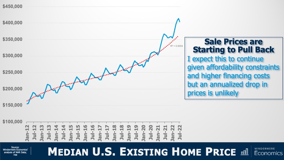
1. There Is No Housing Bubble
Mortgage rates rose steeply in 2022 which, when coupled with the massive run-up in home prices, has some suggesting that we are recreating the housing bubble of 2007. But that could not be further from the truth.
Over the past couple of years, home prices got ahead of themselves due to a perfect storm of massive pandemic-induced demand and historically low mortgage rates. While I expect year-over-year price declines in 2023, I don’t believe there will be a systemic drop in home values. Furthermore, as financing costs start to pull back in 2023, I expect that will allow prices to resume their long-term average pace of growth.
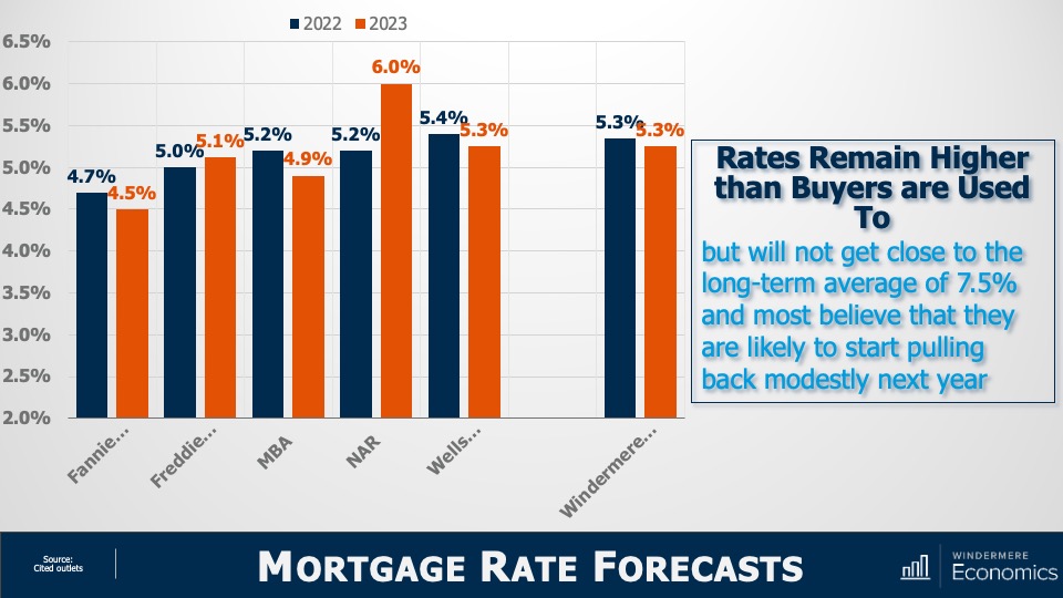
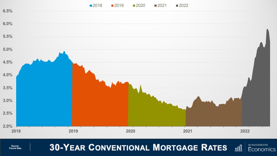
2. Mortgage Rates Will Drop
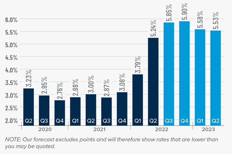
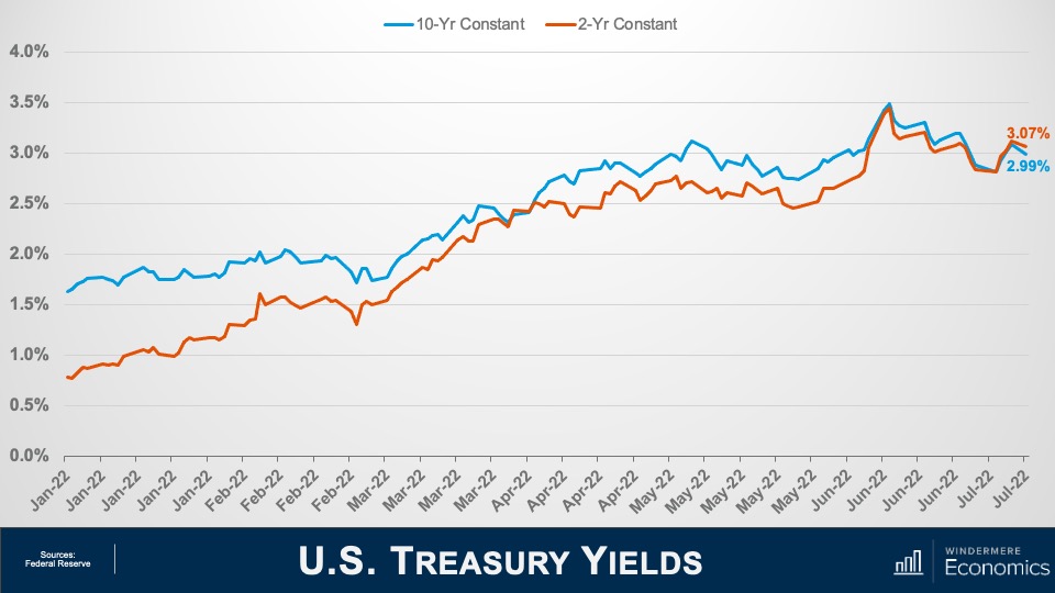
Mortgage rates started to skyrocket at the start of 2022 as the Federal Reserve announced their intent to address inflation. While the Fed doesn’t control mortgage rates, they can influence them, which we saw with the 30-year rate rising from 3.2% in early 2022 to over 7% by October.
Their efforts so far have yet to significantly reduce inflation, but they have increased the likelihood of a recession in 2023. Therefore, early in the year I expect the Fed to start pulling back from their aggressive policy stance, and this will allow rates to begin slowly stabilizing. Rates will remain above 6% until the fall of 2023 when they should dip into the high 5% range. While this is higher than we have become used to, it’s still more than 2% lower than the historic average.
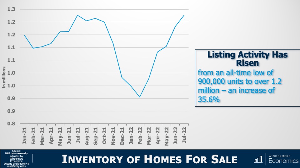
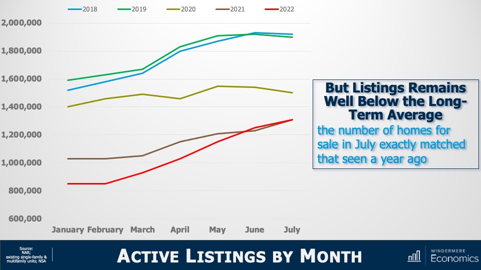
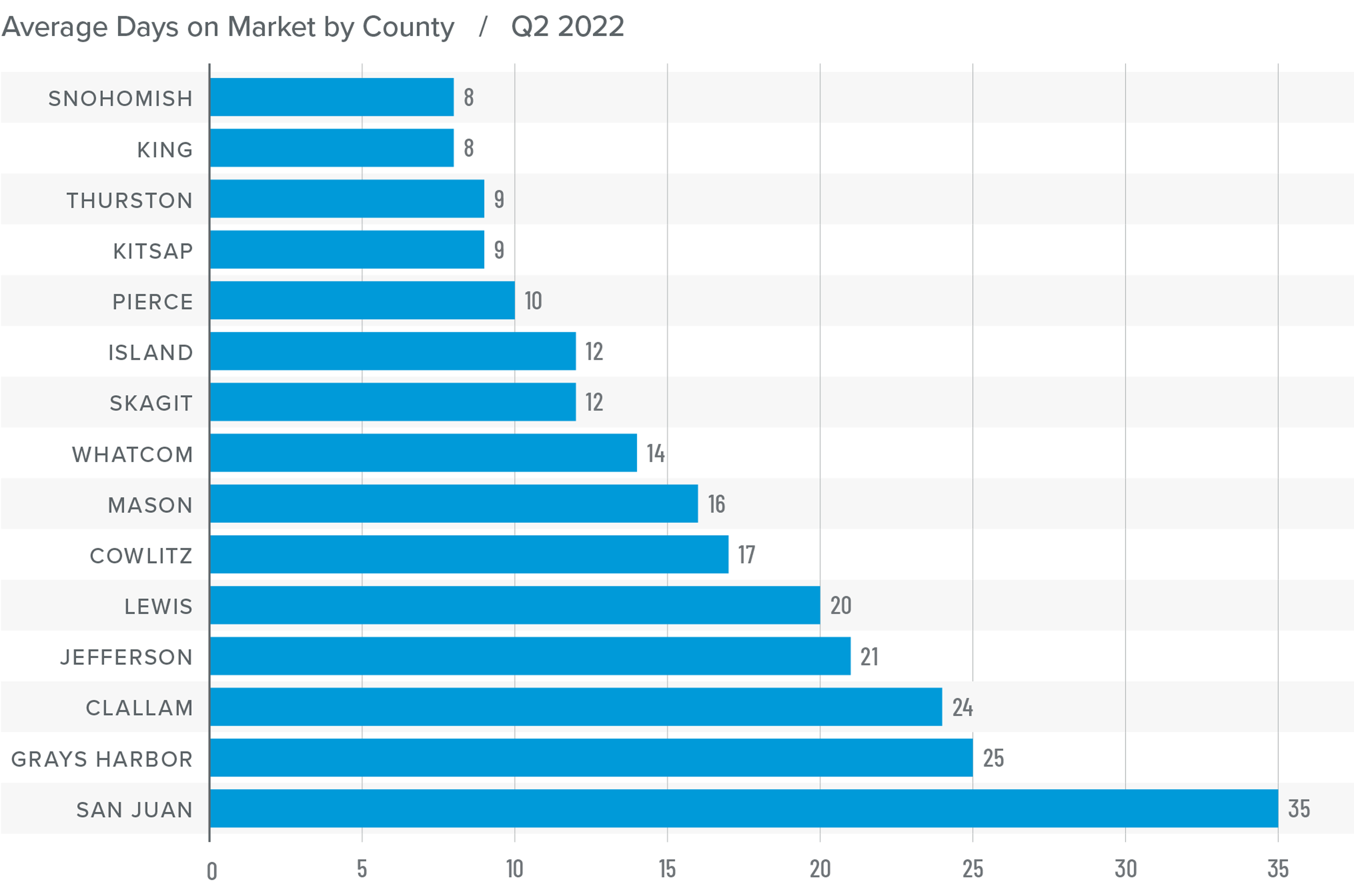
3. Don’t Expect Inventory to Grow Significantly
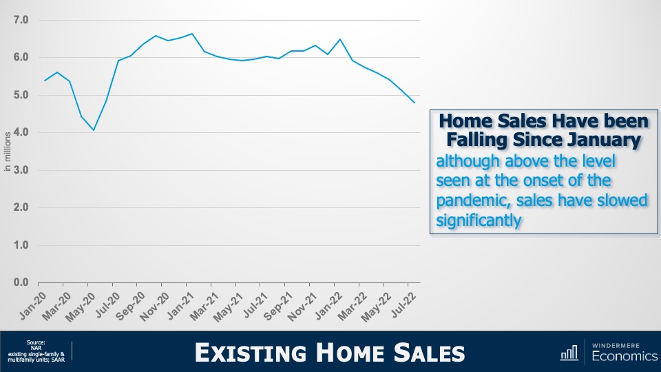
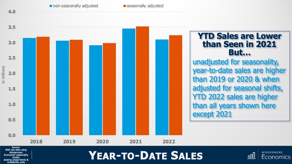
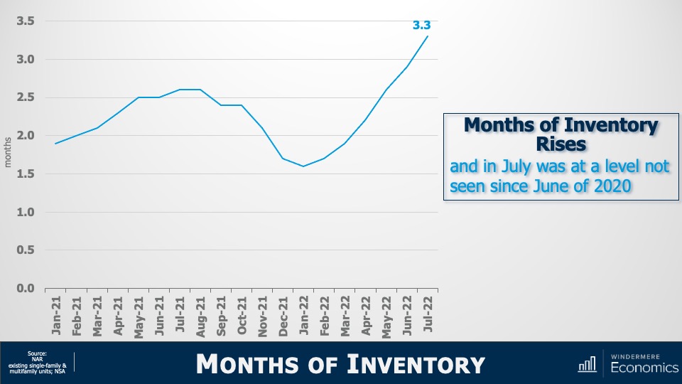
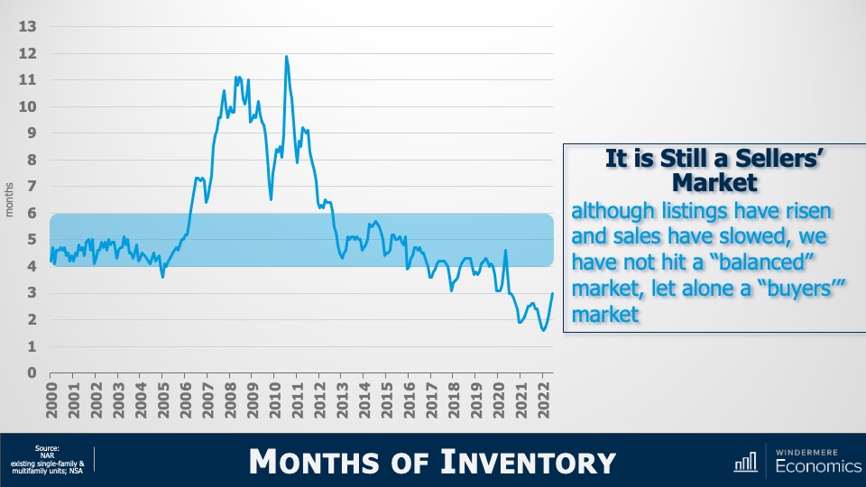
Although inventory levels rose in 2022, they are still well below their long-term average. In 2023 I don’t expect a significant increase in the number of homes for sale, as many homeowners do not want to lose their low mortgage rate. In fact, I estimate that 25-30 million homeowners have mortgage rates around 3% or lower. Of course, homes will be listed for sale for the usual reasons of career changes, death, and divorce, but the 2023 market will not have the normal turnover in housing that we have seen in recent years.
4. No Buyer’s Market But a More Balanced One
With supply levels expected to remain well below normal, it’s unlikely that we will see a buyer’s market in 2023. A buyer’s market is usually defined as having more than six months of available inventory, and the last time we reached that level was in 2012 when we were recovering from the housing bubble. To get to six months of inventory, we would have to reach two million listings, which hasn’t happened since 2015. In addition, monthly sales would have to drop below 325,000, a number we haven’t seen in over a decade. While a buyer’s market in 2023 is unlikely, I do expect a return to a far more balanced one.
5. Sellers Will Have to Become More Realistic
We all know that home sellers have had the upper hand for several years, but those days are behind us. That said, while the market has slowed, there are still buyers out there. The difference now is that higher mortgage rates and lower affordability are limiting how much buyers can pay for a home. Because of this, I expect listing prices to pull back further in the coming year, which will make accurate pricing more important than ever when selling a home.
6. Workers Return to Work (Sort of)
The pandemic’s impact on where many people could work was profound, as it allowed buyers to look further away from their workplaces and into more affordable markets. Many businesses are still determining their long-term work-from-home policies, but in the coming year I expect there will be more clarity for workers. This could be the catalyst for those who have been waiting to buy until they know how often they’re expected to work at the office.
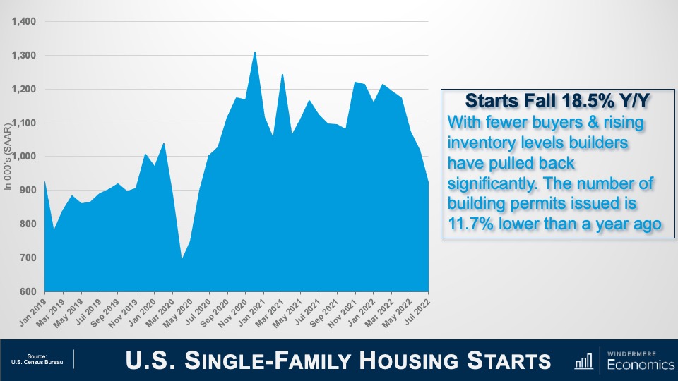
7. New Construction Activity Is Unlikely to Increase
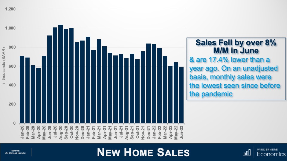
Permits for new home construction are down by over 17% year over year, as are new home starts. I predict that builders will pull back further in 2023, with new starts coming in at a level we haven’t seen since before the pandemic.
Builders will start seeing some easing in the supply chain issues that hit them hard over the past two years, but development costs will still be high. Trying to balance homebuilding costs with what a consumer can pay (given higher mortgage rates) will likely lead builders to slow activity. This will actually support the resale market, as fewer new homes will increase the demand for existing homes.
8. Not All Markets Are Created Equal
Markets where home price growth rose the fastest in recent years are expected to experience a disproportionate swing to the downside. For example, markets in areas that had an influx of remote workers, who flocked to cheaper housing during the pandemic, will likely see prices fall by a greater percentage than other parts of the country. That said, even those markets will start to see prices stabilize by the end of 2023 and resume a more reasonable pace of price growth.
9. Affordability Will Continue to Be a Major Issue
In most markets, home prices will not increase in 2023, but any price drop will not be enough to make housing more affordable. And with mortgage rates remaining higher than they’ve been in over a decade, affordability will continue to be a problem in the coming year, which is a concerning outlook for first-time buyers.
Over the past two years, many renters have had aspirations of buying but the timing wasn’t quite right for them. With both prices and mortgage rates spiraling upward in 2022, it’s likely that many renters are now in a situation where the dream of homeownership has gone. That’s not to say they will never be able to buy a home, just that they may have to wait a lot longer than they had hoped.
10. Government Needs to Take Housing More Seriously
Over the past two years, the market has risen to such an extent that it has priced out millions of potential home buyers. With a wave of demand coming from Millennials and Gen Z, the pace of housing production must increase significantly, but many markets simply don’t have enough land to build on. This is why I expect more cities, counties, and states to start adjusting their land use policies to free up more land for housing.
But it’s not just land supply that can help. Elected officials can assist housing developers by utilizing Tax Increment Financing tools, whereby the government reimburses a private developer as incremental taxes are generated from housing development. There are many tools like this at the government’s disposal to help boost housing supply, and I sincerely hope that they start to take this critical issue more seriously.
About Matthew Gardner
As Chief Economist for Windermere Real Estate, Matthew Gardner is responsible for analyzing and interpreting economic data and its impact on the real estate market on both a local and national level. Matthew has over 30 years of professional experience both in the U.S. and U.K.
In addition to his day-to-day responsibilities, Matthew sits on the Washington State Governors Council of Economic Advisors; chairs the Board of Trustees at the Washington Center for Real Estate Research at the University of Washington; and is an Advisory Board Member at the Runstad Center for Real Estate Studies at the University of Washington where he also lectures in real estate economics.