The Landscape for Mortgage Rates and Inflation in 2022


This video is the latest in our Monday with Matthew series with Windermere Chief Economist Matthew Gardner. Each month, he analyzes the most up-to-date U.S. housing data to keep you well-informed about what’s going on in the real estate market. 


Hello there, I’m Windermere’s Chief Economist Matthew Gardner and welcome to this month’s episode of Monday with Matthew. You know, one of the many things I love about being an economist is that it is a remarkably humbling profession. You see, just when we start to believe that our models are close to perfection, something comes along to remind us that forecasting isn’t an exact science.

And if you’re wondering what I am talking about, I recently took a look at the 2022 mortgage rate forecast I put out at the start of the year and…well, let’s say that rates rose at a far faster pace than I had anticipated. I thought that now would be a good time to take another look at rates and share my thoughts on the direction that they will likely take during the rest of the year and my reasoning behind it. And that means we need to talk about inflation.

30-Year Conventional Mortgage Rates: 2018 – 2022

A graph showing the 30-year conventional mortgage rates for the years 2018-2022. The curve of the graph creates a sine wave, increasing from roughly 4% to 5% in 2018, dropping to roughly 3.5% by the end of 2019, decreasing further to roughly 2.5% by the end of 2020, coming back up to roughly 3.0% by the end of 2021, and spiking up to over 5.8% in 2022 before dipping slightly.


So, a quick look back. As you can see, there wasn’t much to celebrate in 2018, with rates rising from 3.95% to 4.94% before pulling back and ending the year at around 4.5%. In 2019, rates fell following the Feds’ announcement that they were likely done with raising the Fed Funds Rate, and the mortgage market also reacted positively to the announcement from the White House that they were going to impose tariffs on select Chinese imported goods. We saw an uptick in late summer, but that was mainly due to news related to BREXIT.

In 2020, rates were dropping but spiked very briefly when COVID-19 shut the country down and bond markets panicked. But with the Fed jumping in with an emergency rate cut and announcing that they would start buying a significant number of treasuries and mortgage-backed securities, rates tumbled to an all-time low of just 2.66%. In 2021, rates rose as new COVID infections plummeted, but then dropped again as the Delta variant took hold, but ultimately trended modestly higher in the second half of the year.

And then we get to 2022. Rates started the year at just over 3.1% but have since skyrocketed to over 5.8% before a small pullback that started a few weeks ago. In as much as economists expected rates to rise this year, nobody anticipated how fast they would rise. So, what went wrong? Well, there’s actually a rather simple answer.

Even though we expected rates to trend higher in 2022, there were two things we hadn’t built into our forecast models.

  1. Russia’s invasion of the Ukraine
  2. Inflation continued to climb for far longer than we expected

So, how do things look for the rest of the year? To explain my thinking, it’s important to remember that the bond market and, by implication, mortgage rates hate nothing more than high inflation because when inflation is running hot, it limits demand for bonds which, in turn, forces the interest rate payable on bonds to rise and this pushes mortgage rates higher.

But what’s been fascinating to watch is that over the past couple of weeks, rates have actually been dropping which is certainly counterintuitive given where inflation is today. And the only reason I can see for this is that bond traders were thinking that inflation might be topping out.

But then we got the June CPI numbers, and it certainly didn’t suggest that inflation was slowing, in fact it showed the opposite. But even though the total inflation rate hasn’t yet peaked, I believe that a shift has actually started and that we are closer to a peak in inflation than you may think.

Indicators of Inflation: Consumer Spending

Three line graphs titled "Consumer Price Index," "Inflation Adjusted Consumer Spending," and PCE Price Index. The Consumer Price Index shows year-over-year percentage changes from present day back to January 2021, with two lines showing all items and all items less food and energy. The all items line starts around 1.5% in January 2021, gradually increasing to 9.1% in June 2022, while the all items less food and energy line also starts around 1.5% in January 2021 and undulates to 5.9% in June 2022. The "Inflation Adjusted Consumer Spending" chart shows month-over-month percentage changes from January 2021 to May 2022. The line spikes up and down throughout the first half of 2021, going as high as roughly 4.5% around March 2021 and as low as roughly negative 1.5% in February 2021. The line stabilizes for the remainder of the x-axis, ending at 0.4% in May 2022. The "PCE Price Index" graph shows year-over-year percentage changes from January 2021 to May 2022. The line starts around 1.5% in January 2021, gradually increasing through February 2022 around 5% before tapering to 4.7% in May 2022.


The June CPI report showed the headline inflation rate still trending higher but look at the core rate which excludes the volatile food & energy sectors. That has actually been pulling back for the past three months. And consumer spending when adjusted for inflation fell 0.4% in May. That’s the first monthly drop since last December, and I expect the June number when it comes out at the end of the month to show spending dropping even further.

This is a very important dataset that often gets overlooked but it is starting to tell me that the economy is slowing because of inflation and slower spending acts as a headwind to further price increases.

The core PCE price index is up 4.7% year-over-year, but this was the smallest annual increase since last November and you can see that it is also starting to roll over. This index is actually the Fed’s favored measure of inflation as it’s more comprehensive that the CPI number as it measures the change in spending for all consumers, not just urban households.

Indicators of Inflation: 5-Year Breakevens and Producer Price Index

Two line graphs titled "5-Year Inflation Breakevens" and "Producer Price Index." The breakevens graph shows percentage changes from January 2022 to July 2022, starting at 3.0% in January 2022, increasing to 3.59% in March 2022, before gradually decreasing to 2.50% in July 2022. The "Producer Price Index" graph shows year-over-year percentage changes from January 2020 to May 2022, with two lines showing Total PPI and Core PPI. Both lines gradually increase along the x-axis, peaking around March 2022. Total PPI increases from 2.0% from 10.8 in May 2022, while core PPI increases from 1.6% to 8.3% over the same time period.


The five-year “inflation breakeven” has plunged more than a full percentage point since peaking at just under 3.6% in late March. And this number is important as it lets us know where bond traders expect the average inflation rate to be over the next five years.

The Producer Price Index measures inflation at the wholesale, not retail, level and even though the total rate rose as energy costs continue to impact the manufacturing sector, the core rate has been pulling back for the past three months. Now let’s look at some commodity prices and see what’s going on there.

Selected Commodity Prices: Natural Gas, Copper, Soybeans, Wheat

Four line graphs titled "Natural Gas Prices," "Copper Prices," "Soybean Prices," and "Wheat Prices." Natural Gas, Soybean, and Wheat prices all share a similar trend in that they gradually increase from January 2022 to June 2022 before dropping from June to July 2022. Natural gas prices fell by 34% from June to July 2022, while soybean prices fell 10% and wheat prices fell 27% over that same time period. Copper prices are steady from January 2022 to April 2022, before gradually dropping through April and May, then drastically falling 26% from June to July 2022. In summary, prices of all commodities are falling a significant amount over the past month (June to July 2022).


  • The price for natural gas is down over 34% from its recent high
  • Copper prices are down 26% from the recent June peak and down substantially from March
  • Soybean prices are down 10%
  • Despite the war in Ukraine, wheat prices are down 27% from June

Retail Gas Prices: West Coast, West Coast Excluding CA, U.S.

A line graph titled "Retail Gas Prices" with three lines: U.S., West Coast, and West Coast excluding California. All three lines show increases in price per gallon from January 2021 to July 2022. All three lines peak in June 2022. The West Coast gas prices went from roughly three dollars per gallon to $5.68 per gallon in July 2022, the West Coast excluding California line goes from roughly $2.50 per gallon in January 2021 to $5.28 in July 2022, and the U.S. line goes from just below $2.50 per gallon in January 2021 to $4.75 per gallon in July 2022.


It appears as if gas prices have also rolled over. Of course, here on the West Coast it’s more expensive than the nation even when you take California out of the equation.

U.S. Treasury Yields: 10-Year and 2-Year Constant

A line graph with two lines showing the U.S. Treasury Yields 10-year constant and 2-year constant from January 2022 to July 2022. The 10-year constant gradually increases over this period of time from 1.5% in January 2022 to 2.99% in July 2022. The 2-year constant gradually increases as well, from roughly 0.75% in January 2022 to 3.07% in July 2022.


And finally, to cap things off, traders must also be pondering the same numbers as I am because bond yields themselves have been tumbling at both the long and short ends of the yield curve with the 10-year note still yielding less than 3% even after the CPI report and two-year yields, while still elevated, are still down from 2.42% just two weeks ago.

So, given all the charts we have looked at, I hope that you too are seeing some light at the end of the tunnel when it comes to the likelihood that inflation is about to start easing.

No doubt, the headline inflation number for June wasn’t one that anyone wanted to see but, if the trends we have looked at continue, I still expect inflation to start slowly creeping lower, which will push bond prices higher, yields will start to pause—if not drop—and that will allow mortgage rates to hold at or close to their current levels for the time being. Although we could see rates coming down, though they will still start with a five for the foreseeable future. I hope that you have found my thoughts of interest.

As always, if you have any questions or comments about this particular topic, please do reach out to me but, in the meantime, stay safe out there. I look forward to visiting with you all again next month.

Bye now.


About Matthew Gardner

As Chief Economist for Windermere Real Estate, Matthew Gardner is responsible for analyzing and interpreting economic data and its impact on the real estate market on both a local and national level. Matthew has over 30 years of professional experience both in the U.S. and U.K.

In addition to his day-to-day responsibilities, Matthew sits on the Washington State Governors Council of Economic Advisors; chairs the Board of Trustees at the Washington Center for Real Estate Research at the University of Washington; and is an Advisory Board Member at the Runstad Center for Real Estate Studies at the University of Washington where he also lectures in real estate economics.

🚨 Here it is folks! The JULY 2022 Whidbey Island Real Estate Market Update (rolling 12-month report). CLICK HERE TO GET THE PRINTABLE PDF!


🗺️ Stats are separated by area: South, Central, & North Whidbey, and incorporate data from the 12 months prior to our current month.


🏡All stats represent only the residential & condo sales, except for the ones specifically for vacant land. May not represent all market activity.


If you want help interpreting this data and what it means for you. Feel free to message us and setup a free buyers or sellers consultation.


📱 360 331 6006

✉️ whidbeyinfo@windermere.com

🤗 Enjoy!


#wearewhidbey #windermereEconomics

Created by Si Fisher

.

.

.

Data supplied by the NWMLS. Neither the

Board or its MLS guarantees its accuracy. May

not reflect all real estate activity in the market.

The Growing Housing Affordability Problem


This video is the latest in our Monday with Matthew series with Windermere Chief Economist Matthew Gardner. Each month, he analyzes the most up-to-date U.S. housing data to keep you well-informed about what’s going on in the real estate market. 


Hello there, I’m Windermere’s Chief Economist Matthew Gardner and welcome to this month’s episode of Monday with Matthew.

If you’ve listened to me at all over the past several years, you’ll know that I am pretty passionate about one subject: housing affordability. And, given the significant price growth that we’ve seen over the past decade, as well as the recent spike in mortgage rates, I wanted to talk a little bit about what might be done to address this very serious issue.

The Growing Housing Affordability Problem

Now, when we think about housing affordability and how it might be solved, a lot of people get tied up in the minutiae when, quite frankly, it really isn’t that hard a problem to solve. You see, there’s one very simple way to address this: to build more housing units. But, as easy as that may sound, there are a lot of obstacles that are holding new supply back. But before I get to that, I want to share some data with you that might help to demonstrate how serious an issue we all face.

Every quarter, the National Association of Homebuilders puts out its affordability numbers for metro areas across the country. An analysis of sales and incomes allows them to show the number of homes—both new and existing—sold in a quarter that were affordable to households making median income.

Housing is Increasingly Unaffordable

Here you will see numbers from just a few of the 240 metropolitan areas across the country and the share of sales in the first quarter of this year that were “technically” affordable. I think you’ll agree that it’s eye opening.

A map of the United States showing the percentage of homes sold last quarter that were affordable to households making median income in select markets. 32.5% of new and existing homes sold in Seattle were affordable to household making median income, 40.1% in Tacoma, Washington, 43.2% in Portland, Oregon, 41.7% in Eugene, Oregon, 14.4% in San Francisco. 21.9% in San Jose, California, 8.3% in Los Angeles, 14.6% in San Diego, 41.4% in Las Vegas, 25.4% in Bend, Oregon, 25.7% in Boise, and 22.3% in the New York/Jersey City area.


Although I am only showing you a few of the U.S. markets I will tell you that the ten least affordable US housing markets were all in California. The Golden State is also home to 21 of the top 25 least affordable markets in the country. But what you might also find interesting is that our primary cities aren’t the only ones that are suffering from affordability issues, with markets like Bend, Oregon; Boise, Idaho; and even Las Vegas, Nevada becoming increasingly unaffordable for a lot of households.

And it’s worth mentioning that that 48 of the 69 markets where less than half of the homes sold were affordable were in states that have at some point in the past implemented comprehensive planning and growth management legislation. And when governments mandate where homes can and cannot be built, one thing happens: it pushes land prices higher which makes new homes more expensive and limits the amount of new supply that builders are able to provide. So, what can be done?

Well, I will start out by saying that states who have implemented growth management plans, which they generally did to slow or stop suburban sprawl, remain disinclined to move these boundaries, and that means it becomes paramount to not look further out but to concentrate within the urban growth boundaries and decide whether it’s time to think about removing single-family zoning altogether.

This is a fascinating thought, but I must add that I am not suggesting that we do away with single-family homes. Absolutely not! What I am thinking about is the ability for a market to decide what makes the most sense. In order to do so, single-family zones need to allow for the development of denser housing, but also allow the market to decide what’s best. Areas that have implemented such change has given rise to a movement in order to address what is being referred to as “missing middle housing.” For those of you who are unfamiliar with this term let me try and explain.

Missing Middle Housing

A depiction of different housing types from Optico Design Inc. that illuminates the "missing middle" housing types that were common prior to World War II but are now far less common and, therefore, "missing". The housing types in the "missing middle" include duplexes, fourplexes, courtyard buildings, cottage corts, townhouses, medium-sized multiplexers, stacked triplexes, and live-work buildings. The housing types outside of the "missing middle" include detached single-family houses and mid-rise apartment buildings.


This is a great image courtesy of Opticos, a team of urban designers, architects, and strategists who are passionate about adding sorely needed housing options.

They came up with the term “missing middle” as it describes housing types that were actually very common prior to World War II where duplexes, row-homes, and courtyard apartments were in high demand. Unfortunately, however, they are now far less common and, therefore, “missing.”

And the key function of this type of housing is to meet the rising demand for walkable neighborhoods, respond to changing demographics, and provide housing at different price points. You see, rather than focusing on the number of units in a structure—think high rise apartments or condominiums—this type of housing emphasizes scale and heights that are appropriate for and sympathetic to single-family or transitional neighborhoods.

The Decline of Missing Middle Housing Construction

A bar chart showing the number of duplexes to 8-unit buildings built over roughly the past half-century dating back to 1974. The years 1974 through 2021 appear on the x-axis and the number of completed units built appears in thousands on the y-axis, ranging from 0 to 300. On the z-axis, the chart shows what percentage of total new homes completed the y-axis values for that year accounted for. The z-axis ranges from 0% to 18%. The highest values in the chart are 1974 and 1984, when roughly 250,000 units were completed, which was roughly 15% of the total new homes completed that year. The chart gradually declines from the mid-1980s to present day. Since 2007, there hasn't been a single year where over 50,000 units were completed.


And to show you how supply of these types of units has changed, this chart shows the number of duplexes to eight-unit buildings built over the past almost half-century and you can clearly see that up until the late 1980s they were being built in decent numbers, but the 1990s saw a significant shift toward traditional single-family home ownership and builders followed the demand and this type of product started to become scarcer.

Almost 16% of total new homes built in America in the early 1980s were of this style, but that number has now shrunk to just 1.4%—or a paltry 19,000 units.

But I see demand for these housing types growing as we move forward and that buyers or renters, young and old, will be attracted as it will meet their requirements not only in regards to the type of home they would want to live in but, more importantly, it can be built cheaper than traditional single-family housing and therefore it will be more affordable.

But although this sounds like it’s a remarkably simple solution that can solve all our woes, in reality it’s not that easy for two very specific reasons. The first is that many markets are already essentially built out, meaning that in order to develop this type of product, a builder would have to purchase a number of existing homes and raze them in order to rebuild. But given current home values, it’s very hard for a builder to be able to make such a proposal financially.

And the second issue is that current residents within these “transition” areas—which have been developed as traditional single-family neighborhood—simply don’t want to see change. But is this type of product bad? Here are some examples.

This shows row-homes in Brooklyn on the left and traditional “triple-deckers” in Massachusetts on the right:

A side-by-side look at two different types of East Coast building types: the horizontal Brooklyn Row-Homes and the more vertically constructed Massachusetts "Triple Deckers."


This is a bungalow court project in California:


An interconnected building of California "Bungalow Courts" with low-pitched roofs and small porches, all connected by a winding sidewalk.


Here are some Live/Work Units in Colorado:


A white live/work unit in Buena Vista, Colorado with a second-story patio built onto the right side of the building.


These are some amazing mews homes in Utah:


A community of Mews Homes in South Jordan, Utah painted white with arched windows and small eaves hanging above the doorsteps.


And finally, a new terrace housing project that will be built in Washington DC:


A drawing of Terrace Housing in Washington DC showing facades with many windows lined side-by-side on a city street.


Don’t get me wrong, I’m sure that some of you who simply aren’t inspired by this type of architecture, and that is understandable. But can we simply stick with the status-quo? I don’t think so. And some state legislators have already implemented significant zoning amendments in order to try and encourage this type of development.

Back in 2018, Minneapolis was the first city to allow this type of development inside single-family zoned areas. This was followed by Oregon State in 2019. Senate Bill 9 was signed by Governor Newsom of California last year which made it legal for property owners to subdivide lots into two parcels and turn single-family homes into duplexes, effectively legalizing fourplexes on land previously reserved for single-family homes. So, we are starting to see some change.

This is a good start but as I mentioned earlier in areas that are already built out, even this type of forward-thinking legislation will not be the panacea that some want. But I’m not giving up hope.

Addressing the “missing middle housing” would allow for homes of all shapes and sizes, for people of all incomes including workers who are essential to our economy and community. Here I am talking about our teachers, firefighters, administrative assistants, childcare providers, and nurses—just to name a few!

There are currently 45 million Americans aged between 25 and 34 and most aspire to homeownership. However, the massive price growth which, by the way, many of us have benefitted from over the past several years, has simply put a “starter home” out of their reach.

I will leave you with one last statistic. Over 28% of American households today are made up of a single people living alone, and it is anticipated that up to 85% of all U.S. households will not include children by the year 2025. Finally, by 2030, one in five Americans will be over the age of 65.

Are we going to meet the needs of the country’s changing demographic going forward? I certainly hope so, but it will take a lot of work for us to get there. As always, if you have any questions or comments about this particular topic, please do reach out to me but, in the meantime, stay safe out there and I look forward to visiting with you all again next month.

Bye now.

🚨 Here it is folks! The JUNE 2022 Whidbey Island Real Estate Market Update (rolling 12-month report). CLICK HERE TO GET THE PRINTABLE PDF!


🗺️ Stats are separated by area: South, Central, & North Whidbey, and incorporate data from the 12 months prior to our current month.


🏡All stats represent only the residential & condo sales, except for the ones specifically for vacant land. May not represent all market activity.


If you want help interpreting this data and what it means for you. Feel free to message us and setup a free buyers or sellers consultation.


📱 360 331 6006

✉️ whidbeyinfo@windermere.com

🤗 Enjoy!


#wearewhidbey #windermereEconomics

Created by Si Fisher

.

.

.

Data supplied by the NWMLS. Neither the

Board or its MLS guarantees its accuracy. May

not reflect all real estate activity in the market.

Whidbey Island Hiking Trails Near Me

Your guide to gorgeous hiking trails on Whidbey Island

"I took a walk in the woods and came out taller than the trees."

~Henry David Thoreau

Click to see properties for sale on Whidbey Island

Contributed by Jim Tomisser

Are you willing? To get lost that is. With only one road in and out, a straight shot across the length of the island, it would be too easy to find your way back, but most of us come here to get lost.


If you like to drive, my chosen form of therapy, take an easy detour off 525 through Langley or Coupeville. Here, it’s always only one road to follow until you see a downtown. If you’re more adventurous or want to see what Island Life is like for the people who live here, take yourself down small roads unknown in Clinton and find quietude among the evergreens and in the wilderness.


Heggenes Road off of Dear Lake Road is a good ten-minute loop--fifteen if you’d like to leisurely drink in the scenery. There’s no rush on an unfrequented road. Plus, it spits you back out onto Holst Road, which is simply an extension of Deer Lake Road. From there it’s a straight shot back to the highway.

Explore Whidbey Island Driving
South Whidbey Sports Complex Hiking Trails Near Me

Often, the path less traveled is the one worth taking. If you’re inclined to step out of the comfort of your car and breathe the fresh cedar air, there are many walking and hiking trails. Winding seamlessly through the trees and open fields, the paths in the South Whidbey Sports Complex are just some of my favorites. For yet another uncomplicated detour from the main road-there are so many possibilities.

These trails in particular off Langley Road provide options and solace for the weary and the restless. Depending on which route you choose, the stamina you have, and what your goals are for getting outside, you can follow the longer trail that circles around the entirety of South Whidbey Community Park--weaving in and out of the forest--or opt for shorter loops that live and breathe among trees and stay within the sports complex area.

Hiking Trails on Whidbey Island | Windermere Whidbey

Wouldn't you love to live near all these glorious trails? -->

Find Hiking Trails Near me on Whidbey Island

You can’t choose unwisely here, and each trail loops right back into the other. You can choose between five routes depending on your starting point (the park or the complex), and each one is under a mile. The park connector will take you between both parts of South Whidbey Community Park, and the Westling Loop will bring you right back to where you started in the complex.


The park connector, however, is a great place to start for would-be long haulers. It becomes a rather long loop if you take the Waterman Loop detour, giving you something new to look at each step of the way. 

There is no end to each path nor the peace and solitude this place has to offer. Feel free to take a picture of the map posted at the beginning of the trails! There’s no getting lost… unless that was your goal for coming out here.

The dense wilderness is a different kind of captivating. For some more nature-immersive trails within the South Whidbey Parks & Recreation District jurisdiction, the Trustland Trails are a short distance up the road. With more than double the loops and dense vegetation, these trails are likewise suited for a wide range of endurance levels. Some run even shorter than the ones located at the Community Park, but don’t be fooled! If you put them all together you can get just as much exercise out of these wooded trails. 

Trustland Trails Whidbey Island Hiking

For some variety with optional beach views, head further up our beloved 525 toward Coupeville and discover Fort Ebey State Park. Of course, the whole place is a wonder, but Bluff and Kettles Trails are interestingly county-run despite their residence in a state park.

Click image to see properties in the Coupeville Area!

These two in particular model a true island-life marker for the curious visitor and the seasoned local. Be sure to visit the Bluff Trail to traverse the sprawling coastline! Part of this trail is actually privately owned but has been licensed to the county by the owner for hikers’ convenience. If you’re not up for a trail but want the view, take S Ebey Road by car all the way to the water. You can access the Bluff Trail right where the breathtaking overlook is located a couple stairways up from the beach.

Whidbey Island Bluff Trail Hiking near me

For a longer route (nearly four miles round trip), enter through the Kettles Gate and take Kettles Trails through the heart of the reserve. It’s a straight shot to Bluff Overlook if you catch the very end of Campground Trail. If you decide to follow Kettles all the way through you’ll find a rest area and bathrooms. From that fork in the road the distance in either direction is under half a mile (roughly 0.06 or less). With so many options, the overlook is accessible for everyone!

And once you’ve traveled the not so beaten path, a good way to bookend your walk through the woods is a simple, graveled walk through Venture Out nursery. While Bayview Farm & Garden is one of our more traveled hotspots, this nursery offers just as much to folks who love to bring nature home. Amble down these interconnected paths at your leisure while admiring the kind of nature you can call your own. Any direction you walk carves an intentional path through various trees, flowers, and even custom raised flower beds. (The garden gift shop is a bonus!)

Venture Out Nursery Whidbey Island Hiking Trails

Looking to build your dream home near Bayview Corner on Whidbey Island?

Click image above to see properties near this delightful nursery.

Ultimately, no matter your level of experience in the wilderness, Whidbey Island holds space for anyone and everyone. It’s a safe yet exciting place to simply be. It’s easy to navigate, but more than willing to help you escape. It is a stronghold for all who wish to be a new person by the end of the day.

Whidbey Island Night Sky While Hiking

Photos and blog entry contributed by:

The Effects of Today's Mortgage Rates on Your Home Purchase

The Effects of Today's Mortgage Rates COVER

It's vital to understand the relationship between mortgage rates and your purchasing power if you're going to buy a property. The amount of housing you can afford to buy within your financial means is referred to as purchasing power. Mortgage rates have a direct impact on the monthly payment you'll make on your new house. As a result, as interest rates climb, so does the monthly payment you can lock in on your home loan. That could limit your future purchasing power in a rising-rate climate like the one we're in now.

The average 30-year fixed mortgage rate is currently around 5%, and analysts predict that it will rise in the coming months. If you buy now, before the increase affects your purchasing power, you can get ahead of the game.

Mortgage Rates Have a Significant Impact on Your Purchasing Power.

The graph below shows the overall link between mortgage rates and a common monthly mortgage payment for various loan amounts. Let's say your finances allow for a $2,100-$2,200 monthly mortgage payment. The green in the graph represent a payment that is within that range, while the red represents a payment that is outside of that range (see graph below):

As the graph demonstrates, unless you pursue a smaller home loan amount, you're more likely to surpass your desired payment range as mortgage rates rise. If you're ready to buy a home, use this as encouragement to do it now, before interest rates rise and you have to decide whether or not to reduce the amount you borrow to keep inside your budget.

Consult with a Trusted Adviser to Understand Your Budget and Develop a Strategy

When looking for a property, it's vital to keep your budget in mind. The easiest way to express it is as follows,

Get preapproved with today's rates, but also think about what would happen if rates rose another quarter of a point,... Know what that would mean for your monthly bills and how comfortable you are with it so that if rates do rise, you'll already know how to adjust.

Whatever the case may be, the ideal method is to collaborate with your real estate agent and a reputable lender to develop a strategy that takes rising mortgage rates into account. Together, you may examine your budget in light of current rates and devise a strategy for adjusting when rates change.

In Conclusion

Even minor increases in mortgage rates can have an effect on your purchasing power. If you're in the market for a home, having a solid plan is more important than ever. Work with a trusted real estate advisor and lender to plan your strategy for achieving your dream of homeownership this spring.

🚨 Here it is folks! The MAY 2022 Whidbey Island Real Estate Market Update (rolling 12-month report). CLICK HERE TO GET THE PRINTABLE PDF!


🗺️ Stats are separated by area: South, Central, & North Whidbey, and incorporate data from the 12 months prior to our current month.


🏡All stats represent only the residential & condo sales, except for the ones specifically for vacant land. May not represent all market activity.


If you want help interpreting this data and what it means for you. Feel free to message us and setup a free buyers or sellers consultation.


📱 360 331 6006

✉️ whidbeyinfo@windermere.com

🤗 Enjoy!


#wearewhidbey #windermereEconomics

Created by Si Fisher

.

.

.

Data supplied by the NWMLS. Neither the

Board or its MLS guarantees its accuracy. May

not reflect all real estate activity in the market.

Q1 2022 Western Washington Real Estate Market Update

CLICK HERE FOR PRINTABLE PDF VERSION


The following analysis of select counties of the Western Washington real estate market is provided by Windermere Real Estate Chief Economist Matthew Gardner. We hope that this information may assist you with making better-informed real estate decisions. For further information about the housing market in your area, please don’t hesitate to contact your Windermere Real Estate agent.


Regional Economic Overview

The post-COVID job recovery continues. Though data showed the number of jobs dropped in January, February saw gains that almost offset the jobs lost the prior month. As of February (March data is not yet available), the region had recovered all but 47,000 of the more than 300,000 jobs lost due to the pandemic. Of note is that employment levels in Grays Harbor, Thurston, San Juan, and Clallam counties are now above their pre-pandemic levels. In February, the regional unemployment rate rose to 4.1% from 3.7% in December. Although this may be disconcerting, an improving economy has led more unemployed persons to start looking for a job, which has pushed the jobless rate higher. I expect the regional economy to continue expanding as we move into the spring and summer, with a full job recovery not far away.

Western Washington Home Sales

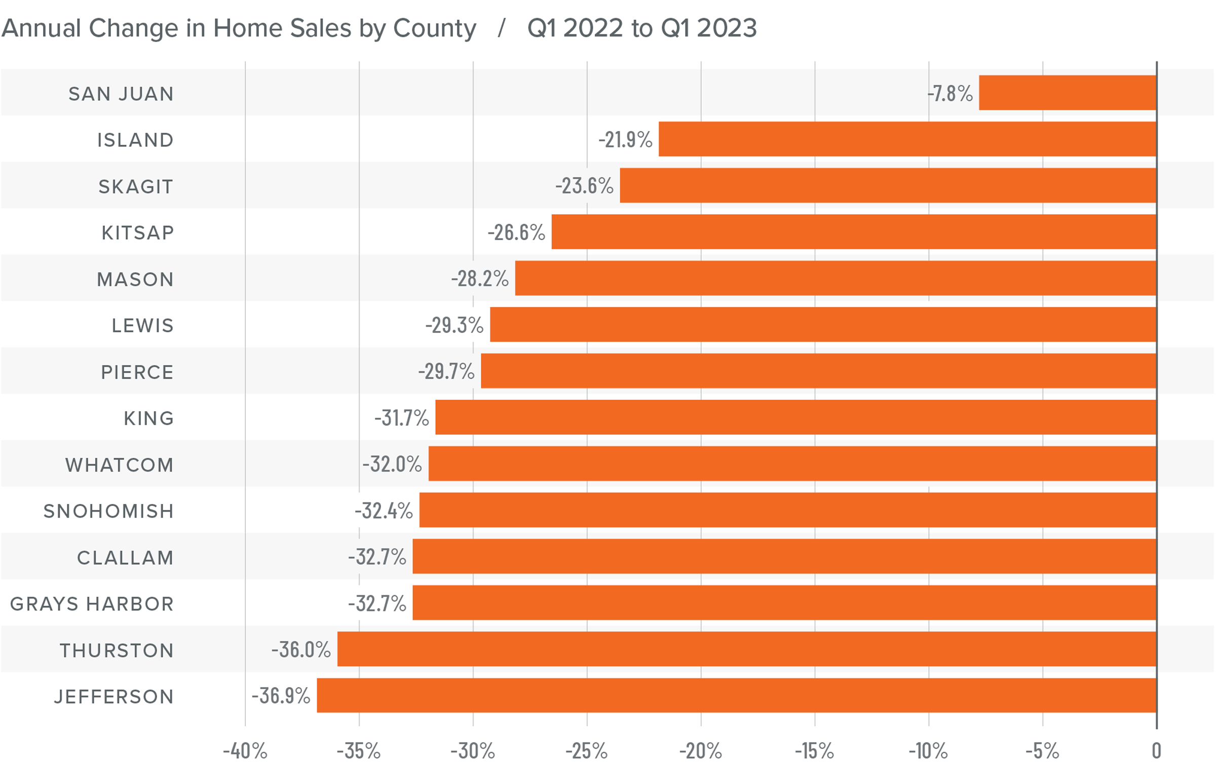
❱ In the first quarter of 2022, 15,134 homes sold, representing a drop of 5.8% from the same period a year ago, and down 31.7% from the fourth quarter.

❱ Yet again, supply-side constraints limited sales. Every county except Snohomish showed lower inventory levels than a year ago.

❱ Sales grew in five counties across the region but were lower across the balance of the counties contained in this report. Compared to the fourth quarter, sales were lower across all market areas.

❱ The ratio of pending sales (demand) to active listings (supply) showed pending sales outpacing listings by a factor of 6.7. Clearly, the significant jump in mortgage rates in the first quarter has not yet impacted demand. Rather it appears to have stimulated buyers partly due to FOMO (Fear of Missing Out)!

A bar graph showing the annual change in home sales for various counties in Western Washington between Q1 2021 and Q1 2022.

Western Washington Home Prices

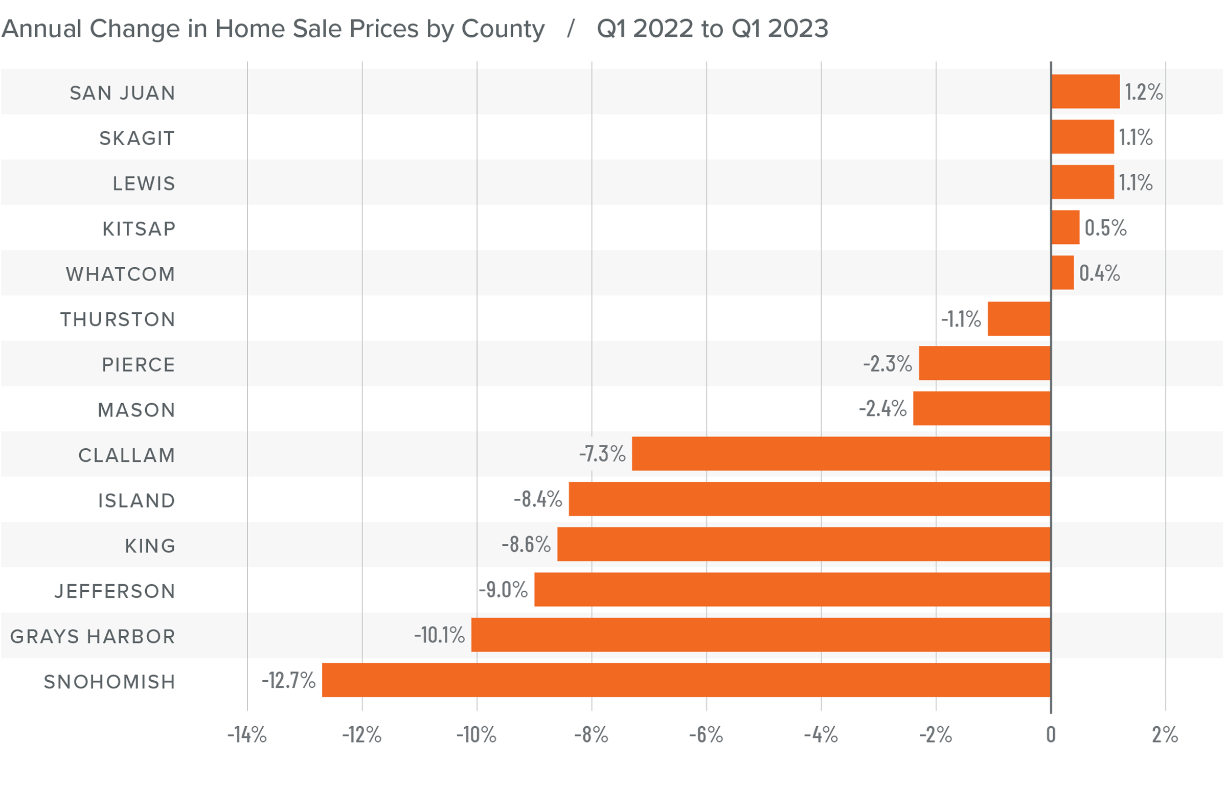
❱ Although financing costs have jumped, this has yet to prove to be an obstacle to buyers, as prices rose 16.4% year-over-year to an average of $738,152. Naturally, there is a lag between rates rising and any impact on market prices. It will be interesting to see what, if any, effect this has in the next quarter’s report.

❱ Compared to the same period a year ago, price growth was again strongest in San Juan County, but all markets saw prices rising more than 10% from a year ago.

❱ Relative to the final quarter of 2021, all but Kitsap (-2.7%), Mason (-1.5%), Skagit (-1.8%), Jefferson (-6.3%), and Clallam (-0.1%) counties saw home prices rise.

❱ The market remains supply starved. While increases in “new” listings suggest that more choice is coming to market, it remains insufficient to meet demand.

A map showing the year-over-year real estate market percentage changes in various counties in Western Washington for Q1 2022.

A bar graph showing the annual change in home sale prices for various counties in Western Washington from Q1 2021 to Q1 2022.

Mortgage Rates

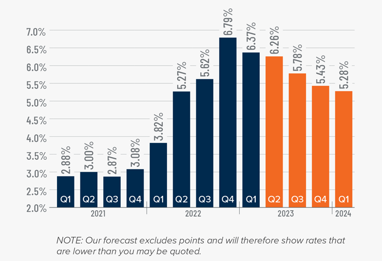
Average rates for a 30-year conforming mortgage were 3.11% at the end of 2021, but since then have jumped over 1.5%—the largest increase since 1987. The surge in rates is because the market is anticipating a seven- to eight-point increase from the Federal Reserve later this year.

Because the mortgage market has priced this into the rates they are offering today, my forecast suggests that we are getting close to a ceiling in rates, and it is my belief that they will rise modestly in the second quarter before stabilizing for the balance of the year.

A map showing the real estate market percentage changes in various counties in Utah during the third quarter of 2021.

Western Washington Days on Market

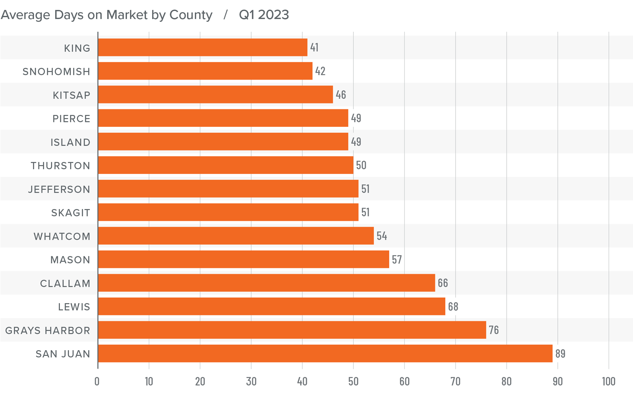
❱ It took an average of 25 days for a home to go pending in the first quarter of 2022. This was 4 fewer days than in the same quarter of 2020, but 2 days more than in the fourth quarter of 2021.

❱ Snohomish, King, and Pierce counties were the tightest markets in Western Washington, with homes taking an average of 11 to 15 days to sell. The greatest drop in market time compared to a year ago was in San Juan County, where it took 23 fewer days for homes to sell.

❱ All but five counties saw average time on market drop from the same period a year ago, but the markets where it took longer to sell a home saw the length of time increase only marginally.

❱ Quarter over quarter, market time dropped in Snohomish, King, and Pierce counties. Jefferson and Clallam counties also saw modest improvement. In the balance of the region the length of time a home was on the market rose, but seasonality undoubtedly played a part.

A bar graph showing the average days on market for homes in various counties in Utah during the third quarter of 2021.

Conclusions

This speedometer reflects the state of the region’s real estate market using housing inventory, price gains, home sales, interest rates, and larger economic factors.

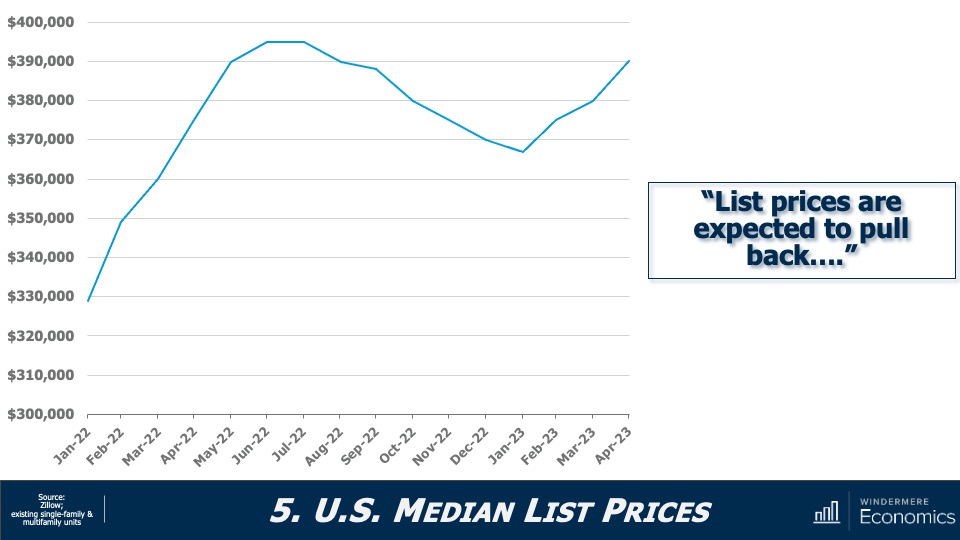
The numbers have yet to indicate that demand is waning amid rising interest rates, but this is sure to become a greater factor as we move into the spring. A leading indicator I pay attention to is changes to list prices and, in most counties, these continue to increase. This suggests that sellers remain confident they will be able to find a buyer even in the face of higher borrowing costs. If this pace of increase starts to soften, it may be an indication of an inflection point, but it does not appear to be that way yet.

A speedometer graph indicating a seller's market in Western Washington during Q1 2022.

Given all the factors discussed above, I have decided to leave the needle in the same position as the last quarter. The market still heavily favors sellers, but if rates rise much further, headwinds will likely increase.

About Matthew Gardner

Matthew Gardner - Chief Economist for Windermere Real Estate

As Chief Economist for Windermere Real Estate, Matthew Gardner is responsible for analyzing and interpreting economic data and its impact on the real estate market on both a local and national level. Matthew has over 30 years of professional experience both in the U.S. and U.K.

In addition to his day-to-day responsibilities, Matthew sits on the Washington State Governors Council of Economic Advisors; chairs the Board of Trustees at the Washington Center for Real Estate Research at the University of Washington; and is an Advisory Board Member at the Runstad Center for Real Estate Studies at the University of Washington where he also lectures in real estate economics.

This Blog Entry Originally Appears on Windermere.com CLICK HERE TO VIEW

This video is the latest in our Monday with Matthew series with Windermere Chief Economist Matthew Gardner. Each month, he analyzes the most up-to-date U.S. housing data to keep you well-informed about what’s going on in the real estate market. 


Hello there, I’m Windermere’s Chief Economist Matthew Gardner, and welcome to this month’s episode of Monday with Matthew. With home prices continuing to defy gravity, mortgage rates spiking, the Fed raising interest rates significantly, a yield curve that is just keeping its nose above water, and some becoming vocal about the possibility that we are going to enter a recession sooner rather than later, it’s not at all surprising that many of you have been asking me whether the housing market is going to pull back significantly, and a few of you have asked whether we aren’t in some sort of “bubble” again.

Because this topic appears to be giving many of you heartburn, I decided that it’s a good time to reflect on where the housing market is today and give you my thoughts on the impact of rising mortgage rates on what has been an historically hot market.

The Current State of the U.S. Housing Market

Home Sale Prices

As usual, a little perspective. Between 1990 and the pre-bubble peak in 2006, home prices rose by 142%, which was a pretty impressive annual increase of 5.6% over a 16 1/2-year period. When the market crashed, prices dropped by 33%, but from the 2012 low to today, prices have risen by 131%, or at an even faster annual rate of 8.6% over a shorter period of time—10 years.
You may think that prices rising at an annual rate that exceeds the pace seen before the market crash is what has some brokers and home buyers concerned, but that really isn’t what has many people scared. It’s this.

Mortgage Rates in 2022

At the start of 2022, the average 30-year fixed mortgage rate was just a little above 3%. But, over a brief 15-week period, they have skyrocketed to 5%. This has led some to worry that the market is about to implode. Of course, nobody can say that the run-up in home prices hasn’t been phenomenal over the past few years, and it’s certainly human nature to think that “what goes up, must come down,” but is there really any reason to panic? I think not, and to explain my reasoning, let’s look back in time to periods when rates rose significantly and see how increasing mortgage rates impacted the marketplace.

Housing and Mortgage Markets During Times of Rising Rates

This table shows seven periods over the past 30 years when mortgage rates rose significantly. On average, rates trended higher for just over a year before pulling back, and the average increase was 1.4%. But now look at how it impacted home prices: it really didn’t. On average, during these periods of rising financing costs, home prices still rose by just over 5%.  Clearly, not what some might have expected. But there were some negatives from mortgage rates trending higher, and these came in the form of lower sales in all but one period and new housing starts also pulled back.

So, if history is any indicator, the impact of the current jump in mortgage rates is likely to be seen in the form of lower transactions rather than lower prices. And this makes sense. Although rising financing costs puts additional pressure on housing affordability, what people don’t appear to think about is that mortgage rates actually tend to rise during periods of economic prosperity. And what does a flourishing economy bring? That’s right. Rising wages. Increasing incomes can certainly offset at least some of the impacts of rising mortgage rates.

Static Equilibrium Analysis – 1/3

To try and explain this, I’m using the median US sale price in February of this year, assuming a 20% down payment and the mortgage rate of 4%. And you can see that the monthly P&I payment would be $1,365. But as mortgage rates rise, and if buyers wanted to keep the same monthly payment, then they would have to buy a cheaper home. Using a rate of 5%, a buyer could afford a home that was 9% cheaper if they wanted to keep the payment the same as it would have been if rates were still at 4%.

But, as I mentioned earlier, an expanding economy brings higher wages, and this is being felt today more than usual, given the worker shortage that exists and businesses having to raise compensation. Average weekly wages have risen by over five-and-a-half percent over the past year—well above the pre-pandemic average of two-and-a-half percent. Although increasing incomes would not totally offset rising mortgage rates, it does have an impact.

Static Equilibrium Analysis – 2/3

To demonstrate this, let’s use the U.S. average household income of $70,611.  Assuming that they’ve put aside 20% of their gross income for a down payment, they could afford a home priced just under $360,000 if mortgage rates were at 4%. As rates rise—and assuming that their income doesn’t—their buying power is reduced by over 10%, or just over $38,000.

Static Equilibrium Analysis – 3/3

But if we believe that incomes will rise, then the picture looks very different. Assuming wages rise by 6%, their buying power drops by just 5% if rates rose from 4% to 5%, or a bit less than $19,000.

Although rates have risen dramatically in a short period, because they started from an historic low, the overall impacts are not yet very significant. If history is any indicator, mortgage rates increasing are likely to have a more significant impact on sales, but a far smaller impact on prices.

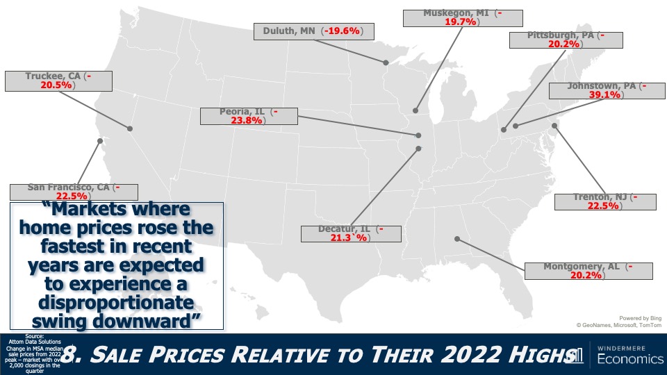
But there are other factors that come into play, too. Here I’m talking about demand. The only time since 1968 that home prices have dropped on an annualized basis was in 2007 through 2009 and in 2011, and this was due to a massive increase in the supply of homes for sale. When supply exceeds demand, prices drop.

So, how is it different this time around? Well, we know that the supply glut that we saw starting to build in mid-2006 was mainly not just because households were getting mortgages that, quite frankly, they should never have gotten in the first place, but a very large share held adjustable rate mortgages which, when the fixed interest rate floated, they found themselves faced with payments that they could not afford. Many homeowners either listed their homes for sale or simply walked away.

Although it’s true that over the past two or so months more buyers have started taking ARMs as rates rose, it’s not only a far smaller share than we saw before the bubble burst, but down payments and credit quality remained far higher than we saw back then.

So, if we aren’t faced with a surge of inventory, I simply don’t see any reason why the market will see prices pull back significantly. But even if we do see listing activity increase, I still anticipate that there will be more than enough demand from would-be buyers. I say this for several reasons, the first of which is inflation.

What a lot of people aren’t talking about is the proven fact that owning real estate is a significant hedge against rising inflation. You see, most buyers have a mortgage, and a vast majority use fixed-rate financing. This is the hedge because even as consumer prices are rising, a homeowner’s monthly payments aren’t.  They remain static and, more than that, their monthly payments actually become lower over time as the value of the dollar diminishes. Simply put, the value of a dollar in—let’s say 2025—will be lower than the value of a dollar today.

But this isn’t the only reason that inflation can actually stimulate the housing market. Home prices historically have grown at a faster pace than inflation.

Hedge Against Inflation

This chart looks at the annual change in total CPI going back to 1969. Now let’s overlay the annual change in median U.S. home prices over the same time period. Other than when home prices crashed with the bursting of the housing bubble, for more than fifty years home price growth has outpaced inflation. And this means we are offsetting high consumer prices because home values are increasing at an even faster rate.

But inflation has additional impacts on buyers. Now I’m talking about savings. As we all know, the interest paid on savings today is pretty abysmal. In fact, the best money market accounts I could find were offering interest rates between 0.5% and 0.7%. And given that this is significantly below the rate of inflation, it means that dollars saved continue to be worth less and less over time while inflation remains hot.

Now, rather than watching their money drop in value because of rising prices, it’s natural that households would look to put their cash to work by investing in assets where the return is above the rate of inflation—meaning that their money is no longer losing value—and where better place to put it than into a home.

Housing as a Hedge Against Inflation

So, the bottom line here is that inflation supports demand from home buyers because:

  1. Most are borrowing at a fixed rate that will not be impacted by rising inflation
  2. Monthly payments are fixed, and these payments going forward become lower as incomes rise, unlike renters out there who continue to see their monthly housing costs increase
  3. With inflation at a level not seen since the early 1980s, borrowers facing 5% mortgage rates are still getting an amazing deal. In fact, by my calculations, mortgage rates would have to break above 7% to significantly slow demand, which I find highly unlikely, and
  4. If history holds true, home price appreciation will continue to outpace inflation

Demand appears to still be robust, and supply remains anemic. Although off the all-time low inventory levels we saw in January, the number of homes for sale in March was the lowest of any March since record keeping began in the early 1980’s.

But even though I’m not worried about the impact of rates rising on the market in general, I do worry about first-time buyers. These are households who have never seen mortgage rates above 5% and they just don’t know how to deal with it! Remember that the last time the 30-year fixed averaged more than 5% for a month was back in March of 2010!

And given the fact that these young would-be home buyers have not benefited from rising home prices as existing homeowners have, as well as the fact that they are faced with soaring rents, making it harder for them to save up for a down payment on their first home, many are in a rather tight spot and it’s likely that rising rates will lower their share of the market.

So, the bottom line as far as I am concerned is that mortgage rates normalizing should not lead you to feel any sort of panic, and that current rates are highly unlikely to be the cause of a market correction.

And I will leave you with this one thought. If you agree with me that a systemic drop in home prices has to be caused by a significant increase in supply, and that buyers who are currently taking out adjustable-rate mortgages are more qualified, and therefore able to manage to refinance their homes when rates do revert at some point in the future, then what will cause listings to rise to a point that can negatively impact prices?

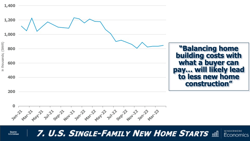
It’s true that a significant increase in new home development might cause this, but that is unlikely. And as far as existing owners are concerned, I worry far more about a prolonged lack of inventory. I say this for one very simple reason and that is because a vast majority off homeowners either purchased when mortgage rates were at or near their historic lows, or they refinanced their current homes when rates dropped.

And this could be the biggest problem for the market. Even if rates don’t rise at all from current levels, I question how many owners would think about selling if they were to lose the historically low mortgage rates that they have locked into. It is quite possible that for this one reason, we may experience a tight housing market for several more years.

As always, if you have any questions or comments about this particular topic, please do reach out to me but, in the meantime, stay safe out there and I look forward to visiting with you all again next month.

Bye now.

This blog entry was originally posted on Windermere.com and can be viewed HERE